This is part two of the current series on tools changing the way that you draw. Specifically pens! You can see part one here.
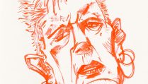
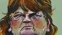
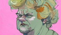
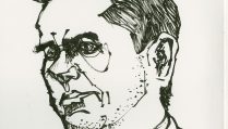
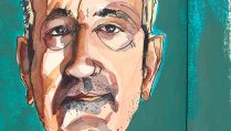
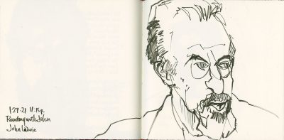
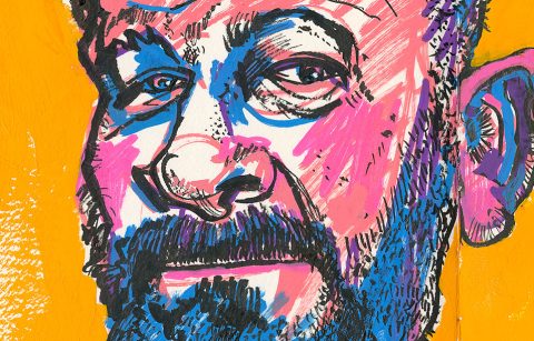
Today I’ve putting up three sketches of musician and artist John Lurie.
He has had a series on HBO about his life on a Caribbean island. It’s a show where he paints and chats, and then interacts with his housekeeping staff and some locals (though not many). I find it an interesting show to watch and have enjoyed sketching him.
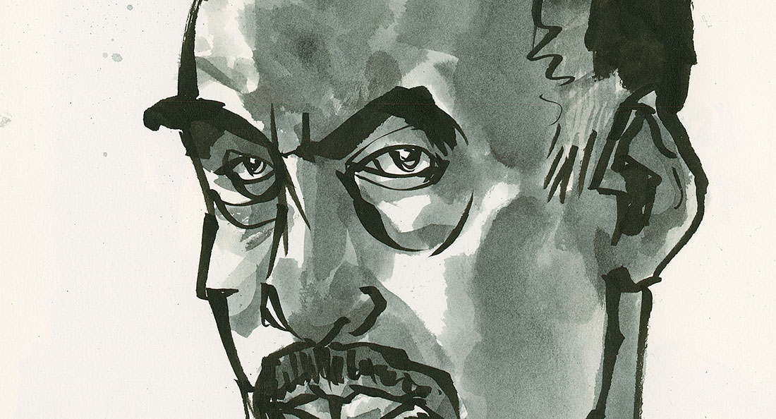
The opening image is done with a solid fiber tipped brush pen that is starting to get a little dry so the line is breaking up. I’m working in a hand made book that is about 8 inches square and contains Fabriano Artistico hot press watercolor paper.
There’s a sort of sparseness to the detail I included as the old brush tip was pretty floppy and not controllable. (Tools matter.)
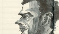
On this second page spread (the same journal, small hot press watercolor paper), I used my go to pen, the Pentel Brush Pen (fine tip, pigmented ink, grey squeezy body). I added ink washes to that sketch (on the left).
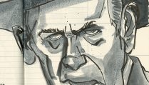
The next day, while watching another episode I used a very dried out Sakura Pigma Professional Brush pen, which has a solid fiber tip. I used it to scribble and feel around for the different features.
Tools Dictate
Tools dictate a number of things to us—how fine or bold we can go with one stroke, how much detail we can fit into the same scale or space, and of course, if the tool is drying out, how limited a value range we actually have.
I think you can see that from the three portraits I’m showing here.
When we keep in mind the attributes and limits of our drawing tools we can use them to best advantage, or have fun pushing them out of their comfort zone.
Have some more fun this week drawing the same subject with different drawing tools.
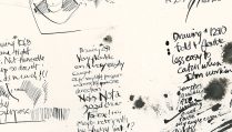
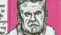
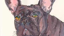
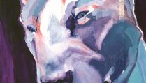
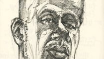
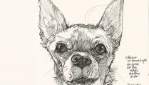
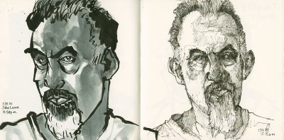
mmm yes you can see the man in each but the tools have changed the emphasis maybe? Certainly the addition of more form building is wonderfully handled with both wash and hatching in the double spread. So much fun to see….
I’ve almost filled a sketchbook of portraits gleaned mostly from Earths world pics…and am always delighted at the changes that happen with a tweaking in material choices. I’m using PPBP on toned paper with gouache over the top…it’s fun to see what changes when I swap out the gouache to straight watercolour or my beloved PPBP to an oil pencil. Same same different
I guess emphasis is what you could call it. I see it as different possibilities with different pens and emphasis is definitely rolled into that. But I don’t consciously think of it that way. I’m still emphasizing the eyes when I start. What I end up with, well that’s anyone’s guess.
My FAVORITE way of sketching is with brush pen and gouache. So absolutely freeing. I look forward to being reconnected with my art supplies!!!
I don’t do a lot with oil pencil. My friends the Avidors use (or used to use) them quite a bit.
For me using gouache or watercolor; or watercolor used transparently and the same watercolor used opaquely is a mood thing. We have candy bars here (which you didn’t have in the 1970s and doubt you have now in Australia) called “the Mounds Bar” and “Almond Joy.” The latter has an almond and milk chocolate over coconut. The former has only coconut filling and dark chocolate. Their ad campaign since the 1960s (and still if they advertise?) is “Sometimes you feel like a nut, sometimes you don’t.” (That actually always bothered me because I always feel like dark chocolate with coconut and never milk chocolate, but often would like a nut with the dark chocolate but they don’t offer that…just saying.)
For me deciding on whether to paint opaquely (with watercolor or gouache) or transparently is like that slogan.
And for me the choice is also about what texture do I want today (nut, no nut kind of thing).
Time is also a factor for me because I know with gouache or using watercolor opaquely I can redo and redo and redo, so I often change my color palette course in mid course and do other things on the fly if I’m using gouache and that means it will take more time. If I don’t have the time I tend to just go with watercolor used transparently.
I know all these things effect what the emphasis ends up being. Right now I just feel like I’ve been in limbo so long without my studio and supplies (except for a few basic ones) that I’m past eager to move on to whatever the next phase is!
I’m glad you have studio mates who lend themselves to either treatment (the magpies). I loved having the girls around for that reason (and of course many others).
Having written all that I was looking at the screen and saw the John Lurie sketches and I think that if I were to describe it as emphasis it would be on detail because I see with anything else but the finest tipped pen, I’m emphasizing on something more stylized, but the finer tipped pen is fussy detail (even when scribbled). Maybe sometimes I just need to remind myself I do see those things?!