 Artists make choices all day long.
Sometimes the choices are obvious. I drew my dogs all the time, obviously because they were live in life models. I draw birds because they have occupied my mind my whole life. I work in watercolor and pen and ink because I love the notions and physical realities of drag, paper sizing, resistance, and speed of application.
Does paper color matter? I think it does for a host of reasons I’ve written about countless times before.
Sometimes I actually have rational reasons for the paper choice I pull out of the drawer or off the shelf.
Sometimes I simply want to play.
I picked up a couple pads of Chairefontaine’s mixed media toned papers—there’s a grey, a natural (tan), and a green.
I suppose that the green paper is meant for landscape artists. I’d certainly would want to use it if I were a landscape artist.
But to me, well this color green which they call sage is one of my favorite colors. So they had me at “hello.”
I tested it by sketching on it with a Platinum Carbon Black ink felt-tip marker (solid fiber brush tip). (I purchase these at Wet Paint, and before they carried them I got them at JetPens.)
I rarely use these markers. I bought a bunch of them for the Minnesota State Fair one year, and found they were generally too inky. You fill them by inserting the Platinum Carbon Black ink cartridges you might already put in your fountain pen when you travel and don’t want to carry a bottle of ink—so if you love that ink it’s just another way to get it on the paper.
I had some of these pens still sitting around (they emerged as the unpacking began) and I wanted to see if the pen had fallen back in favor with my hand.
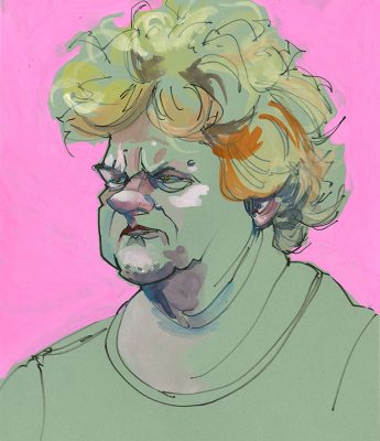
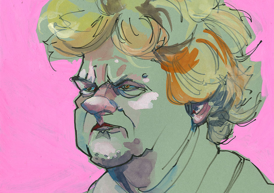
On this paper it had the perfect amount of drag and I quickly made this sketch from one of @Earthsworld ‘s Fair goers.
And then because it is a mixed media paper I threw on some watercolor—just in areas that were important to me—that substantial nose, those eyes, the chin, and of course the interesting hair.
Why let all the green paper show through—well I think it creates more drama in the face than rendering the entire face. That’s the fun thing about painting—you get to decide where the paint goes. (The background is pink Montana Acrylic Marker, added because I wanted to separate the hair, which is light in color from the green paper color.)
I hope you have some fun deciding where you want the paint to go!








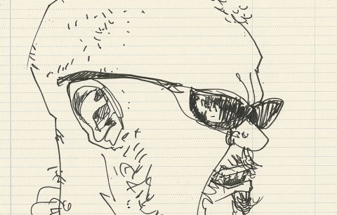
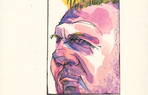
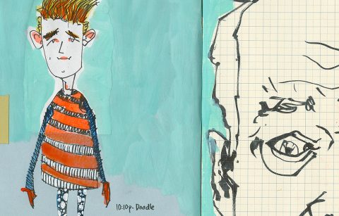
Reminds me of what my design instructor repeated time and time again, “Art is about choices.”
Yep, we can’t really get away from choices. Thanks for stopping by Ted.