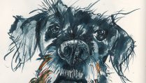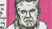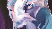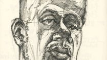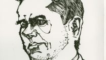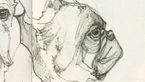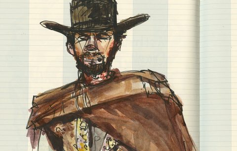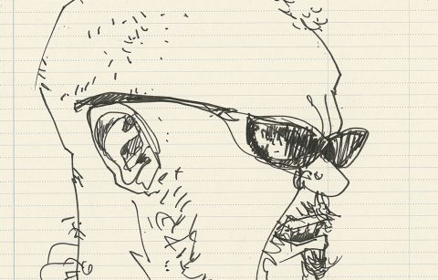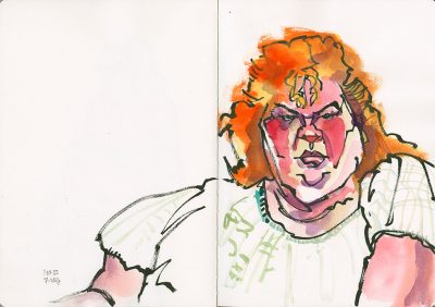
Sometimes the subject you want to capture requires you have bold lines, so you pick a bold brush pen.
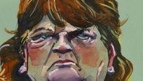
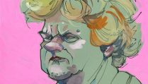
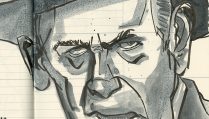
Perhaps there is an emotion in a person’s face that you want to capture? Then it’s important to let the color palette choices you make support that.
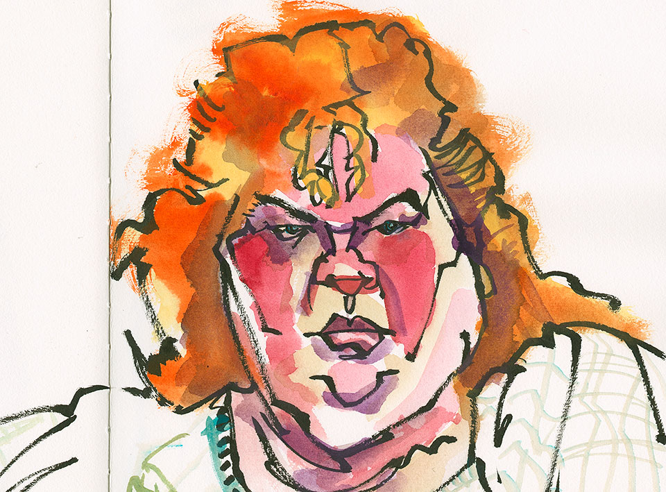
Here’s a very angry woman. The bright colors of her hair and face are pushed to create more intensity and to support the bold lines. (Bold lines love strong colors.)
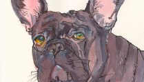
You can do this with any subject matter.
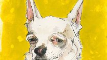
Take a look at a couple images from my Minnesota State Fair Journal 2018 for example. Yes, I’m trying to capture realistic colors on the animals I’m sketching, but I alter my colors to appear more muted if an animal is resting making sure that I use color temperature to help bring the face forward on this pig I’ve linked to.
And in this sheep, I explore ways to mute the yellow tones and create a consistent overall warmth even in the shadows, with my color mixes.
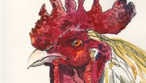
Angry roosters get warm, not cool browns.
Suspicious ducks not only get details and focus in the face, but again the warm reds draw attention from the cooler shadow colors.
Vibrant realistic facial colors are very dramatic on a sleeping guinea fowl, but the use of muted browns (neck feathers and upper body) and grays (lower body) help create a sense of color within all that patterning.
Play with making the focal point of your subject matter a brighter local color version, than the same local color elsewhere, as you see in this squash painting.
And don’t forget to take backgrounds and their influence on a subject’s colors into account, as you can see in this eggplant portrait.
Exercise
Yes, it doesn’t matter what the subject matter is—still life, live model, photo/television reference—you get to decide how to use one of your most valuable tools—the colors in your palette.
Spend time this week and through the weekend, selecting subjects that you want to work with in color, to use your color choices to build the emotion you see or want to impart on your subject.
Keep sketching.
