This post continues yesterday’s discussion of paper from a visual journaler’s perspective.
This post was last revised on February 28, 2019—because things change.
Some Paper Recommendations
Below are some papers that we discussed as a group at November’s meeting of the MCBA Visual Journaling Collective. I have provided my thoughts about them. Because these are my thoughts I encourage you to try the papers yourself before you dismiss them or before you make a bulk purchase. (You might want to buy sample packs as suggested in part one of this topic.) I’ve tried to be accurate in my info, but always double check before you buy. (Note that I couldn’t find a way to make a superscript 2 for the weight fraction: gm/m2—the 2 should be a superscript. When I do it with Typepad’s text controls the leading between my lines is messed up and that’s a greater evil. Just read and imagine a superscript; you can do it.)
If a paper is readily available I have not listed a vendor. You should be able to find it at Daniel Smith, Wet Paint, Talas, Jerry’s Artarama, Cheap Joe’s, and so on. If I only know of one vendor I have provided a link. Also if I’ve been able to quickly think of an example from one of my journals that is already scanned and on my website I’ve provided a link to a journal page using that paper, so click and see some extra work.)
Buying Sheets Not Pads, If You’re Binding
Before I get into the papers I just want to stress that for the most part I purchase papers in loose sheets rather than in pads or blocks, if I am going to BIND that paper.
I find that the binding and padding process tends to flatten the paper texture and tooth a little and I don’t like that. Blocks and pads have their usages, but not as a source for paper you want to bind into a journal. For me, buying a block of watercolor paper now and then is useful for onsite sketching, but 95 percent of the work I do is on loose sheets that are used full-size, trimmed to a size I want to work on, or bound into books at a page size I desire. You’ll find your own preferences as you test and use paper.
Mixed Media Papers
My current (2019) paper for binding is Strathmore’s 500 Series Mixed Media paper. It is a 100 percent cotton paper that is sized for wet media. It doesn’t work exactly as a watercolor paper, but the sizing takes watercolor brilliantly and it is also suitable for watercolor pencil, water-soluble crayons, inks, pens (including dip pen), acrylic markers, stenciling, collage, gouache—you get the idea.
Be sure you are purchasing the 500 Series. (You can read about the 400 series by using my blog’s search engine.)
This paper is great for binding!
Drawing and Printmaking Papers
Always buy a tester sheet and try your media on it. I’ve found that many printmaking papers, while wonderful to draw on, don’t take watercolor washes in the same way, and often not in a useful way. They simply aren’t sized like watercolor papers.
Sizing is the liquid treatment added to a paper during and after manufacturing (depending of if a paper in internally or surfaced sized or both) to ensure that ink and paint isn’t simply sucked up into the paper.
Printmaking papers are sized to keep printing ink where it is wanted, not aid in the floating of watercolor paint here and there as watercolor paper sizing does! The following papers have yielded good results for me in my journaling.
Rives BFK: A 280 gm/m2 printmaking paper that folds easily, tears readily, and comes in white (250 gm/m2), cream, gray, and tan. The sheet sizes vary. I love the tan 30 x 44 inch. The larger paper gives me more leeway when planning unusual book sizes. This paper is great for pen and ink, will accept watercolor washes, and is thick enough for most artists’ needs. Colored pencil pops on the tan!
Stonehenge Printmaking and Drawing Paper: a 250 gm/m2 paper available in a couple different sheet sizes and several neutral colors (whites, creams, tan, gray, etc.). Fans of this paper love it not only for printmaking but for drawing. I like to watercolor on it.
Update 2019: If you read some early posts on this paper from 2008 to maybe 2014 I have mixed feelings about this paper. I find that the surface is stiff and the pencil early on moved with difficulty for me. But over time I’ve transitioned away from the photo-realistic approach I had to color pencil work and I have adapted my color pencil still to a looser approach and find that is well-suited to this paper. It’s now one of my favorite papers for color pencil drawing and one of my favorites for graphite drawings as well. I am also fond of working on this paper with gouache.
Beware of the new colors released with the Kraft Brown a few years ago. It cracks when you fold it even with the grain and therefore isn’t suitable for book binding projects. (I have not had this trouble with the original white, cream and light tan.)
Despite the fact that the Kraft Brown and other new colors crack when folded with the grain I enjoy working on this paper in loose sheets with pen and ink, the Pentel Pocket Brush Pen, and gouache.
It is an extremely affordable art paper that teachers can find readily available.
Folio: Caveat—this is not the same paper sold under this name before 2000. A new mill makes it to different specs. If you can get past that memory of a great paper you’ll find much to enjoy about this new paper. This 22 x 30 inch, 250 gm/m2 sheet is made in the USA. It is 100% rag, has a neutral pH and has two attractive deckle edges. It comes in a white and antique white. The latter is slightly buttery in color and I prefer it. Folio has a slight vellum surface, is easy to print on and is an excellent drawing paper. I also enjoy working on it with watercolor. (I adapt my approach by using less water.)
Johanot: Someone asked about this printmaking paper at the meeting. I don’t have current information on its specific weight but it is hefty enough for collage and is an acid free, 75% cotton sheet with 4 deckle edges; bright white in color. It has a pronounced, toothy texture and a very soft, absorbent surface. I found that it sucked ink out of pens, and was best with dry media. It was rather stiff to fold. The biggest problem I had with this paper is that when making a casebound journal the glue between signatures didn’t hold and the paper delaminated. If you are doing a sewn-on-the-spine construction where this wouldn’t be an issue you might enjoy this paper.
Gutenberg: a 180 gm/m2, 31x 41 inch sheet which is a creamy sand color (not yellow), with gray flecks. The sheet has four deckle edges and a laid texture. It is also pebbly in texture. This is a lovely all round paper. (There is a 130 gm/m2 sheet but I find that too lightweight if I am going to do a lot of collage.) There is a slight difference between the front and back of the sheet so you will want to collate signatures so same face is on both sides of the page spread.
February 2019 Note: This paper was discontinued by the mill in 2016 and brought back at the end of 2017. I found the new release not suitable for my visual journaling work and mixed media work. I currently don’t recommend any of the weights available.
Magnani Annigoni Designo: a 32 x 40 inch, 250 gm/m2 sheet, that is smooth, with enough tooth for drawing and colored pencil. It takes watermedia well (and is sized to do so). It has a lovely tan color with dark flecks. Glueing between sigs tends to come apart because of the paper’s softness. You decide what you can live with.
Hahnëmühle Biblio: This is a 41.5 x 31 inch sheet that I don’t have a weight on, but it is probably around 120 gm/m2. It’s acid free, light weight with a pebbly surface, takes wash OK (though I have one friend who does the most wonderful ink and Caran d’Ache NeoColor II work on it; so she definitely loves it for watermedia). It’s not as opaque as I like papers to be and the very ragged fibrous tears make turning pages difficult (if you cut your paper, or have longer fingernails this probably isn’t going to be a problem). It folds and tears great.
Velin Arches (Arches Text Wove): New name same paper. A 120 gm/m2 paper that is 100 % cotton, has 2 natural and 2 tear deckles. It has a slightly cold press, pebbly texture. Maybe it’s the internal sizing but I find this sheet very strong and a delight to work on with watercolor and pen and ink. It isn’t as opaque as I typically like and you can see this on some of my journal pages, but it is so fun to work on that I just have to keep using it.
Much to my distress and that of my students we discovered that in about 2016 Arches started calling everything Velin outside of the US and dropped the Text Wove portion of the name. I still use it in my own binding and in my Simple Round Back Spine online binding class (it’s one of the suggested papers), but I need to caution anyone purchasing this paper outside of the US to be sure that they are getting the same paper. The weight is the biggest clue!
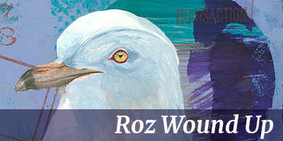
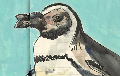
Zerkall Nideggen: A 120 gm/m2, 25 x 38 inch paper that is light sand in color, with subtle gray flecks and a pronounced (very pronounced) wavy laid pattern. (It is also available in 22 x 30 inch sheets, but I like the larger sheet which gives me more options.) Against all preconceived notions of what paper I might adore, I love this paper even though it isn’t thick or smooth. Oddly it is very OPAQUE! I find it suitable for light watercolor washes (gouache looks spectacular on this sheet), colored pencil, and pen and ink. Collage and cut outs proved to be no problem for me though heavy collage enthusiasts might find it a bit lightweight. (The pigeon on Nov. 29, 2009’s post was on this paper as it is the paper in my current journal.)
February 2019: I believe that the 25 x 38 inch sheet has been discontinued. I haven’t received confirmation yet. It’s still available in the 22 x 30 inch (sometimes listed as 21 x 30) and I use it a lot in my binding projects.
Magnani Pescia: A gorgeous, lightly sized, printmaking paper with a smooth, even tooth that is a delight to draw on. It takes light washes (but not really well; you’ll have to find a new way to paint on this paper and it may not be what you enjoy). Even though it is 300 gm/m2 it tears and folds nicely. It comes in white, cream, and a beautiful robin’s egg blue (a truly stunning color to see and work on). The glue between signatures in a traditional case binding does not hold well (the paper is too soft and it literally detaches from itself, exposing the recesses of your spine). If you are making a non-adhesive binding with signatures sewn-to-the-spine with exposed stitching the problem with gluing is gone and I recommend this paper.
Pastel Papers
Many pastel papers are suitable for bookmaking. The bright tones available will delight the colored pencil artist. Since most sheets have a different texture front and back, I find it helpful to take a moment to collate my folded sheets so that the same surface is facing the same surface in a signature. Drawing across a page spread I then have the same uniform surface on facing pages.
Hahnemühle Bugra: At 33 x 41 inches this sheet yields some wonderful book sizes with little waste. At 130 gm/m2 it is still stiff enough for collage work. Wet media is very iffy on this paper because of buckling and absorption, but try it. There is a laid texture that is more pronounced on one side.
Fabriano Ingres Cover Heavyweight: A stiffer, slicker, more resistant surface than Bugra, it takes most media (watercolor buckles the surface, but again, experiment). The sheet is 19.75 x 27 7/8 inches, 160 gm/m2, with a laid surface, and comes in a variety of colors. Great for accordion fold constructions.
Hahnemühle Ingres: A 90 gm/m2 paper that is 18.75 x 24.75 inches. There is a laid pattern; it’s softer than Bugra; it’s economical; lots of colors. The inexpensive cost of this sheet makes it a great choice if you are making books with school children who will just be using pencil. It’s also a great choice if you like to work with colored pencil in your journals. Colored pencil really pops on it.
Watercolor Papers
At the meeting everyone was pretty much married to Fabriano Artistico if they wanted to use a watercolor paper. Sadly this paper has recently changed. (See my page on tearing down this paper for comments about its change.)
When selecting paper for books making my concern is for a paper that folds without cracking! I do not, therefore, use any Arches watercolor paper. It all cracks badly. Even the 90 lb. weight! The same wonderful sizing that makes it the choice of so many watercolorists causes a horrible folding problem. Choose one that meets your criteria.
Fabriano Artistico: This 22 x 30 inch, 140 lb. (or 90 lb.) watercolor paper comes in a creamy “traditional” white and an “extra” white variety (which is bright white). The HP is particularly good for pen and ink and detailed watercolors (e.g., botanical illustration). Because this paper has changed I’m using what I have in my flat file (old stock) and looking for alternatives. Currently I’m testing T.H. Saunders Waterford and Winsor Newton.
February 2019: Please note that around 2000 the sizing on this paper also changed. Instead of using gelatin sizing they now use a vegetable/starch sizing that is much more draggy on your brush. I still use this paper (both cold and hot press) to bind into journals, but it is not the favorite it was 20 years ago. I prefer working with Strathmore 500 series Mixed Media paper, or using TH Saunders/Waterford.
TH Saunders/Waterford: This 100 percent cotton paper is gelatin sized, neutral pH, and comes with two natural deckles and two tear deckles. It comes in a cream white and a high/bright white. You used to be able to find it in a lot of places in both 90 and 140 lb. weights. I will bind with either. It’s my favorite watercolor paper.
Kilimanjaro: This watercolor paper is available in a bright white and a natural white. It is 140 lb. and made by Cheap Joe’s. You can read more about it on that company site. It has a vegetable/starch sizing so it works a little draggy. It is only available in cold press. It binds up well.
Strathmore Aquarius II: The most unusual watercolor paper saved for last—this 22 x 30 inch, 80 lb. sheet has a cold press surface. It is made of synthetic and cotton fibers. The synthetic fibers keep the thin paper from buckling. It’s true. Even sloppy wet washes dry to an almost flat paper! It’s amazing. You may also like the weight because your pages won’t be as stiff as the thicker watercolor papers. Also, you can get a lot more pages of this paper in the same spine width space as a thicker paper.
Hopeful Possibilties
Canson Heritage: This is a 100 percent cotton paper with a non-animal sizing that isn’t as draggy as others with similar sizing. I have just recently (fall 2018) begun testing this paper. You can use my blog’s search engine to find posts about this paper. I’m including it in this list because I’m hopeful it might be useful for binding. I enjoy working on it as loose sheets. I’ll report more when I’ve been able to experiment more. Available in 22 x 30 inch sheets it is at the higher end of the price spectrum.
Specialty Papers
Tyvek: I used the variety called Tyger Rag, but it is discontinued. Basically Tyvek is made up of non-woven fibers (visible!). Yes it’s the same stuff used to make indestructible envelopes. I liked to paint and dye it, but with Tyger Rag the paint didn’t rub off later. Recent samples from stock at Talas and other vendors did have a rubbing off problem. I suggest you write to Dupont for a sample card and test the samples, then look for a vendor that carries varieties you find suitable to your methods. Try dyeing it by rubbing it with acrylic inks and paints. Tyvek creates interesting puzzles for the experimental book artist. Think sewing, melting (with ventilation, a respirator, and fire safety precautions!), draping, etc.
February 2019: I have found that some books I made with this product during the transitional period before it was discontinued (so I might not have had the same variety) did not bind well—i.e., I used some for covering book board in traditional case bindings. (The non-woven structure of this material made it suitably strong to resist cracking at the cover hinges.) However, I discovered that in about 6 years time sample books I had stored showed that the Tyvek was pulling away from the book board. I’m pretty fastidious when it comes to gluing down cover material so because of this concern I discontinued using any Tyvek in my book arts projects.
Yupo: A plastic sheet (size, weight, and cost varies) sold by in catalogs and locally everywhere. One “paper” I don’t mind buying in a pad. I love slick surfaces for drippy watercolor effects. It doesn’t get any slicker than this! And if you really don’t like something, just wash it away. Worth looking into for special journals and effects. You can’t tear it with a bone folder though!
Papers Beyond My Budget
Twinrocker Handmade Papers: This mill makes exquisite all purpose and watercolor papers, but at prices I can’t afford with my journaling habit. I have made a few journals with Simon’s Green, when I’ve been feeling flush. The paper is a delight to work on and its light greenish color makes it a delightful choice for gouache. (The paper color is more accurate on the second posting’s scan.)
Papers I Avoid
We all have our pet peeves and by now you know one of mine is paper that cracks when folded WITH the grain. I won’t use them for books. I’ve had problems with Coventry Rag and Rising Gallery 100. I also avoid these papers because I don’t enjoy drawing on their surfaces. It’s a personal thing. Try them out. You might find the surface compensates for the cracking; or maybe you have more moisture in your environment and the cracking is less.
And finally I don’t use Crown Vantage, Mohawk Superfine Text (or Cover Weight) because they are too thin for what I want to do. If you mostly write in your journal, all three are fine papers.
So What Papers Do You Enjoy as a Visual Journal Keeper?
As I mentioned in part one of this paper article, don’t forget to let me know if you know a vendor who sells sample packs of art papers (not sample pack of paper prepared for digital work which can be found everywhere, but art papers). And let me know what papers you absolutely hate or love, and specifically why, so that other people can cling to it if that characteristic appeals to them or avoid that paper!
Remember to keep testing. You never know when some company is going to buy your favorite paper company and change how they make your favorite paper; or when the craftsman responsible for that paper retires or simply leaves, or…well you get the idea. Keep testing.
And don’t leave your paper in your flat file. Use it. You might find that it is just the paper you have been looking for all these years and the sooner you use it the sooner you can start enjoying it and buy more. And use more. Until of course they discontinue it. At which time you’ll have found a new favorite. Be flexible. Keep journaling.








I’m always interested in what you have to say on the subject Ros. I’ve just been on a bookbinding class. I’ve made some books with Saunders Waterford 90lb hp paper (imperial size). The teacher – who is used to conventional bookbinding (binding theses – that sort of thing) didn’t really want me to use anything very thick so this was the thinnest watercolour paper I could find. It seems very nice although the grain does mean that the most economic use of the paper produces books that are either much bigger or a bit smaller than I’d ideally like
Julie, I use those sheets and just start by tearing off a bit here and there depending on what size journal I want; so if I want to get 8 x 8 inch or so journals which is pretty normal for me and the grain is going with the 30 inches you can get 4 pieces that are about 7.5 inches. If you first pre-tear off a strip along that 30 inch side of say 6 inches you’ve got a 16 inch measurement which when folded is 8 inches, so an 8 x 7.5 inch textblock. That’s a nice size to work with.
And you can still fold the strips with the grain and get 3 inch wide papges any height you want up to 30 inches (which of course is very odd, but could be fun. Point is even the strips are useful.
Don’t know what size you like to work in but the 8 almost square can be a nice way to go.
Roz
Roz, this is a great run-down of papers for journals. I want to add a couple of my preferences:
FRANKFURT by Zerkall is the “sibling” of Nideggen, and remains one of my very favorites. Instead of a sand color, it is a light creamy color, and has the same wavy laid pattern. It is lightweight but sturdy, and takes light washes well.
ARCHES TEXT LAID. This is a surprising one, as I thought I had ordered Arches Text Wove (Velin) but after it came and I got over my disappointment I decided to use it anyway to see what it was like. (I have to order my paper online and have it shipped because I live in a very rural area). Although it seemed more absorbent and scratchy and I had to use bolder pen lines, I grew to love the look of sketches and watercolor washes in it. And I managed to fill the whole journal without getting frustrated–now it’s one of my favorites to look at with its textural surface.
Maria
Maria, thanks for the two additions to the list. Those are both great papers. I don’t use Frankfurt much because if I am going to use a lighter weight paper I tend to use Velin (Arches Text Wove) or Nideggen, the latter specifically because it is toned.
But I’m glad you suggested it because I do tend to get locked into what I use and forget that there are other papers that people might like, especially because everyone doesn’t like working on toned papers!
I’d have to go and look at old sample books I made with Frankfurt though and remind myself if I like the opacity. Do you like the opacity of the paper when dark ink is applied?
The Arches Text Laid is an interesting suggestion. I used it years ago in some journals for kids in a nature journaling class where we were only going to be working in pencil. I can’t find any notes that I ever painted on it, so now I’m excited to order some up and see how I like that surface. An old paper rediscovered!
Many thanks!
Roz
Hi Roz,
You have a wonderful blog! I found it recently while researching bookbinding techniques online and have greatly enjoyed reading all your recommendations. Last week, I made a simple notebook to jot down art ideas and was so pleased with the result (photos posted on my art blog). With that success, I’ve signed up for a local bookbinding class—it’s four sessions, roughly once a month; the first one will involve making paste papers for covers.
Gina, I’m so glad you enjoy the blog and that you have signed up for a class in your area. I’m glad I was able to spark your interest. I hope the class is a great one and you come away with fun books to work in.
I envy you making paste papers. I was only today lamenting to a friend that my kitchen has been torn up for over two years (a minor repair low on everyone’s priority list it seems) and so I can’t make paste paper. I’m dangerously low in my supply.
You will really love making it. It’s too fun!
Roz
Hi Roz, I just finished reading your article on paper for journals and was thrilled to hear of some papers that I am unaware of until now. I have been searching for a good paper to use in my sketch journals that will accept watercolor and are easy to draw on. I recently tried a sheet of Somerset Velvet (printmaking paper@ Jerrys Artarama). Pencil seemed to glide over it and it took my watercolor really well. I don’t know how well it would work all torn down into signatures though. I am going to try and find the Strathmore Aquarius II that you reviewed before I make a final decision.
I wish that you were closer, I would definitely take your book binding class. I have been sewing signatures using TrumpetVine Travels Moleskin Reloaded method, but am very unhappy with gaps in my signatures. I obviously am missing something–maybe gluing signatures together is something I should try.
Anyway sorry for digressing, this was really to give you kudos for your paper article and let you know about Somerset Velvet paper.
Thanks for sharing your knowledge with us–it really is appreciated.
Donna, I’m glad you found the paper piece useful.
I have used Somerset Velvet (and a lot of the other Somersets (there’s a newspaper, and a black and a whole bunch of designations I can’t recall off the top of my head). It’s an excellent paper and you won’t have any difficulty tearing it down into signatures.
It didn’t make my main list because I don’t find it as fun to work on as Rives BFK; it has much to recommend it, however. So if you enjoyed working on it I say go for it. You’ll make a journal you really love.
Strathmore Aquarius II is a bit of a conundrum for some folks, especially if they work on watercolor paper all the time. While it is a wc paper it reacts differently and people need to allow for a bit of an adjustment.
I like pencil on SAII but I don’t like colored pencil as well, and I definitely don’t like watersoluble colored pencil on SAII; in case that helps. My favorite thing on SAII is a Nexus pen and watercolor or gouache.
I’m not familiar with the TrumpetVine Moleskine method so I don’t know what steps are there or left out, but if you have gaps inbetween your sigs I suggest you try to modify the method simply by adding a few traditional back of spine prep methods, including gluing the spine. These can be found in any standard book on binding.
Watson or Johnson from my essential bookbinding shelf (see Pages in the left column of the blog for the complete list) will cover that for you. You can do everything else you were told to do but just add those steps.
Have fun.
Roz
Roz, what were your conclusions on the Saunders Waterford hot press paper? I have a small 90 lb. sample that I tried out, and it appears that it would work well for ink and watercolor wash.
Thanks!
Katy
Katy, I like it a lot. I actually have a post on watercolor papers I’m working on but haven’t had time to do all the tests I want. Look for it in the summer.
Since Fabriano Artistico changed (I wrote about this last fall) I’ve been looking for something to replace it and I like TH Saunders Waterford a lot. I don’t have a piece in front of me right now, but I remember that the only downside I found to it is that it isn’t the “color” I like. It isn’t quite as bright white as I like. In the 1990s it was the only paper I used.
The 90 lb. and the 140 lb. both fold and tear nicely for book binding.
Hi Roz,
First, whenever I need advice on anything to do with making journals, etc. I check your website. Recently, I decided I wanted to explore other papers, and here you are!!
I’m currently using Mohawk Superfine in the journals I make, but as I’m not an avid watercolor person, it *seems* to be ok. Just a little WC here and there for fun.
I used to do Colored Pencil paintings on Fabriano Uno hot press, but I understand it’s been discontinued. I LOVED THAT PAPER!!! I’d sure like to find something like it for both my CP work, and for making journals.
I’d also heard raves about the Stonehenge and have been thinking about trying it, but I trust your judgement. 🙂
I’ve got this page bookmarked and will start experimenting with other papers. Thanks so much!!
Sherri
Thanks Sherri! That’s great that you can find what you need here.
Funny you should mention Mohawk Superfine. I use it to make decorative papers sometimes, and used to use it for some books, but several years ago I made a couple books with it and when I started to work in them I found the SMELL of the paper put me off. Something about how it was when I wet it a little, and also just in general.
It has a wonderful smooth surface (though a friend told me there is a toothier version I haven’t tried), and you cannot beat the price. I have used it in classes sometimes in order to keep the cost of the book supplies down, so people can learn the technique and then go use the paper they want in their next book, budgeting their costs.
All I can remember though is that last book I made with it in 2003 or so, and I just started whipping through it, drawing everything in sight just so I could get through it.
I think there are other papers, such as Folio and Stonehenge that you’ll enjoy perhaps, depending on what you like to do, but if you want to do a little watercolor for fun here and there but use colored pencils a lot check out Arches Text Wove, now called Velin Arches. It’s a lightweight sheet as is Mohawk Superfine which you’re used to, BUT it is very sturdy, has sizing that makes it actually fun to paint on, and the slight nubby texture is great for pencil or colored pencil, but also for pen and ink, an all around great paper. I think you’ll really love it. The one draw back, which I’ve talked about on my website and blog, is that it can be a bit see-through, but it’s more opaque than Mohawk Superfine, and the other great attributes more than make up for this.