
Before doing my watercolor demo at Wet Paint on April 7, 2018 I had to test the “Classic” cold press sample I’d been given. I feel that “Classic” is a bit confusing as names go. To me that sounds like “traditional,” or “original.” While I don’t drink Coca Cola, it sounds like Coke Classic and carries those connotations.
On the day of my demo I even brought up this naming issue with the company rep who was present. I mentioned that 40 years ago the word “professional,” was used to indicate supplies that were good enough for a professional illustrator to use, but not archival enough for fine art work. This made sense because all an illustrator had to do was create work that “lasted” long enough to be photographed and then it didn’t matter if the piece fell apart or faded.
Recently other companies have started to pick up the word “professional,” but this time around the meaning seems to have been skewed to mean “professional artists” specifically “fine artists.”
Since I’m as old as I am, I can’t really do anything about changing or dislodging the context within which I “grew up.” To me one of the big problems with the naming of Winsor & Newton’s new watercolor paper is that it is confusing to the buyer, but not just the older artist, all artists.
Despite audience confirmation of this confusion the rep looked right at me and said, “You’re an artist, you don’t need to remember anything, you don’t need to know.”
Wrong answer. He missed the memo. Artists do need to remember and do need to know. We need to know what is in the products we use to protect not only our end product and our artistic vision, but also we need to know what’s in something to protect ourselves. (Allergies, ethical stances, economic realities, you name it—there are hundreds of reasons an artist needs to know.)
It didn’t help that until I drew Wet Paint’s attention to the error in the fiber content listing for “Classic” on the Winsor & Newton site and Wet Paint called it to Winsor & Newton’s attention, someone at Winsor & Newton really needed to know to, or was simply confused. They had the Classic watercolor paper listed as a wood free paper. (It has been updated and now correctly states that it is a cellulose/wood pulp paper. The Professional paper is wood free.)
Painting on the Winsor & Newton Classic Watercolor Paper
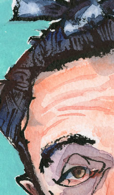
Remember, even though the Classic contains wood pulp it’s acid free. So I encourage you to give it a try—if you like to work with your Pentel Brush Pen (either Pocket or the pigment pen with the gray barrel).
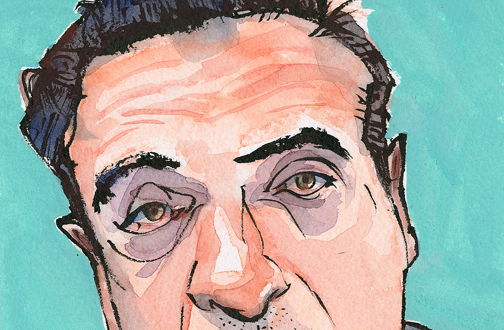
As you can see in today’s image the pen lines are ultra crisp. This paper has vegetable sizing like the Professional paper, but the texture of the paper (a bit more compressed, because it came from a pad) and sizing feel different on this paper. There is almost a sense of moving the pen across a “crunchy” layer that holds the tip up. Crunchy isn’t the right word. It’s just all I can think of, it’s like the pen is cutting through the sizing and laying a line of ink down, even though there is no pressure. And there is a very slight sound of drag.
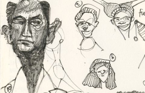
I like to sketch with the Pentel Brush Pen on plate bristol and Hahnemühle’s Nostalgie because the lines are so crisp. They are crisp on this paper as well.
And the ink dried very quickly, which is good, because I like to start to paint right away, and the first color I went in with was that Saturn Red I’m in love with right now, because it is so pinkish and great for some caucasian skin tones.
I found that on this paper, which is cold press, the washes didn’t like to flow easily around, but went easily if I pushed them. And they held crisp edges, as you can see in the detail, if I wanted that. (Lifting off edges of washes is possible, the total lift off to white on this paper isn’t easy.)
If you lay your washed down in a deliberate way I think you’ll enjoy the properties of this paper. It reminded me of painting on TH Saunders DIGITAL watercolor paper (watercolor paper that had been treated to take ink jet ink).
The paper texture of Classic Cold Press is more uniform as you can see from the forehead area in the detail image. But it isn’t a distracting uniformity, at least I didn’t find it so.
I actually enjoyed working on this paper from the moment I touched it with my brush pen until I finished my watercolor washes. I added the Montana acrylic marker background because I wanted to test it on this paper. It’s a bit difficult to push around because of the sizing. I could have worked harder to get a smoother application, but I felt this sketch was finished.
Right now pads of this paper are on sale at Wet Paint. The 10 x 14 inch pad of 12 sheets is $12.57. I haven’t done the math to work out the area of paper in the pad compared to costs of full sheets you tear down, but this seem pretty reasonable for paper of this size that is so fun for brush pen work. (Adding wire binding will bump up your cost about $2.)
For me this Classic paper in cold press was the fun discovery in my tests.
I just thought you needed to know about this paper!

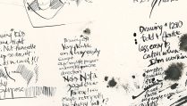






“You’re an artist, you don’t need to remember anything, you don’t need to know.”
Whooo-wee. Is it just me, or did I just get a big stinky whiff of sexism? Anyway. Love your site, love your work, all of it. Keep on keepin’ on.
scone—I think there was some sexism in his comment, but for me the issue was the total condescension—the idea that we as artists (men and women) just need to buy product and not know or remember anything about it; we just need to give over our money. With all the paper products still out there I think it’s a poor position to take.
My whole life, whether it has been in design, or teaching art and book arts, or even dog training (for tracking) has been about communication; about communicating knowledge and understanding. So I’ll keep on. I am buoyed by my sense of humor.
He didn’t read his audience very well. They were all there to be able to know and remember so they could make informed choices about how they each spend their art budget!