
Note: This is part one of a three part review of the new Watercolor papers from Winsor & Newton. The others will be coming out over the next week. Please wait to read all the parts before you decide to dive in or hold back.
Change Happens: Winsor & Newton Kills One Watercolor Paper and Releases a New One
Important: Several years ago I purchased some OLD Winsor & Newton Watercolor paper. I loved it. I tried to get more in the 90 lb. range because I loved making books out of it. At the end of last year in the #2017BigBind I tore down the last of that OLD paper I had and made it into several journals. I’m working in a large landscape journal of it right now. (OK I’m typing right now, but when I get up from the computer I’m going to go and paint on that paper.)
If you have any of that OLD Winsor & Newton Watercolor paper enjoy it. The new version recently released is NOT THE SAME PAPER.
Thee important changes leap out at me—first the new paper is no longer gelatin sized. I like to work on papers that are gelatin sized. Second the surface has changed. Hot Press on the old paper was a true hot press paper, i.e., smooth. The new hot press you’ll see in part 3.
The third change I noted was that the back of all the papers I tested for this three part series had decidedly different fronts and backs. For many painters this doesn’t matter. For me I like the shift in the surface to be as slight as possible from the front to the back of the sheet. I realize that in manufacturing this isn’t always possible, I’m just telling you what I like.
The reason I like the front and back surfaces to be similar is that I bind papers into books. When I tear paper down I collate the pages so that when the paper is folded into signatures each page spread has the same paper surface across the spread. This means I can work easily across the gutter with out changing my paint application methods because the paper surface changes on the facing page.
If the difference between the front and back of the surface is great, even if I take care to collate my pages as described above it means that every other page spread I’m painting in a vastly different way from the previous spread. I’d rather not do that.
The difference between the front and back surface of each of the 3 papers I tested for this series was so great that I didn’t even test these papers for folding, tearing, and gluing characteristics necessary to have a great binding. I will not be binding any of this paper into books. (If you do and you enjoy the resultant book drop me a line.)
I still have several OLD Winsor & Newton 90 lb. Hot Press watercolor books I just bound. These contain the OLD paper as I just indicated.
Going forward on my blog you will see paintings from those books and I will refer to it as OLD WINSOR & NEWTON watercolor paper. Unfortunately I can’t go back through 2300 posts and find all the Old Winsor & Newton images and relabel them because they often were categorized by subject not paper. Anything predating April 2018 is Old Winsor & Newton.
The NEW Winsor & Newton Professional Watercolor Paper Testing Begins

In advance of a watercolor painting demonstration at Wet Paint on April 7, 2018 I was given a 22 x 30 inch sheet of Winsor & Newton’s new Professional Watercolor Paper to work on. You can see an example of direct brush painting on this paper in this post.
The “Professional” is their no-wood-pulp paper. It is being sold as their fine art paper. (I explain my thoughts on their naming for there watercolor papers in part two of my review.)
When I first learned of it I wrote to them and was told it was sized with vegetable/starch, but it couldn’t be called a vegan paper as some papers are labeled, because the sizing was mixed in the same vats as the gelatin sizing for other papers.
I think that’s a good thing—I don’t like vegetable/starch sizing on watercolor paper (though so many manufacturers are going this way), and the sizing on this paper, perhaps because it picks up a little bit of gelatin in the mixing, works better than most of the other’s I’ve tried. (I still prefer working on Fabriano’s vegetable sizing to this paper.)

That said, if you love gelatin sizing on your paper you’ll find this paper disappointing to work on. The washes will be less responsive, more draggy.
Again, since it’s a matter of degrees I found that I could work on this paper without changing my method much. It wasn’t as fun as working on a gelatin sized paper, but it was still a fun experience. (I found that on my direct brush painting I was able to lift colors not easily, but sufficiently. And most important, I could lift without damage to the Professional Cold Press paper.)
I find the paper well within the soft to bright white range which most artists will appreciate. I find the washes a bit difficult to move on the paper. The sizing wants to hold it in place. You can push it around, but it isn’t the flowing action you get on most gelatin sized papers—remember this is a vegetable/starch size.
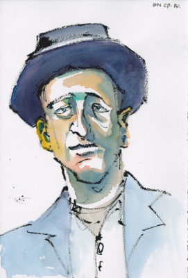
Dragginess is the best way to describe it. I have a sensation of the paper moving over something rough (the sizing, not just the texture of the paper) that I don’t have when working on a gelatin sized paper.
But what I did find in this paper is that it will take layering, you can clean up your edges of your washes if you want, and you can go back into areas to layer more washes after you’ve lifted color off. Is it the strongest paper out there? No, you aren’t going to have unlimited undos as you might on stronger paper, but the paper was more than serviceable.
I found the cold press texture to be a little too uniform in look when the paint went on. (See the cheek of the detail image from today’s main image.) But there are ways to break up that look with your brush strokes.
My main issues with this paper were: 1. not gelatin sized, 2. not suitable for binding if you like the sheet to be similar in surface front and back, 3. A bit draggy on the brush, and 4. Too textured when using brush pen—it broke up the strokes too much.
For me Winsor & Newton had a great paper, with a great surface, that was fun to paint on. I don’t understand why they killed that paper and brought out this new paper.
This new paper is a good paper, but it isn’t a great watercolor paper.
As a good paper, and a new paper, this paper has to prove why I should buy it instead of all the other papers I’ve already used and come to love, or the other new papers I’ve tested and find amazing for what I want to do going forward.
As simply a good paper I won’t be working with it any more.
I won’t forget about it. I may need to return to it if another company decides to kill one of the other papers I like. We live in a world of vegetable/starch sized papers.
Change happens.
But until all my other favorite papers become extinct I can’t justify buying and using this paper.



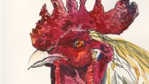





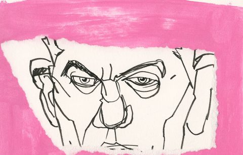

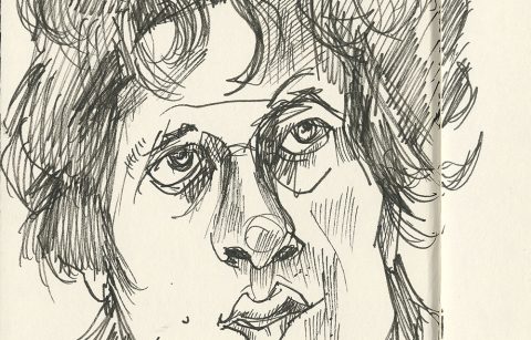
The portraits you’ve been posting to accompany your posts lately are just killer good looking. Love them!
Thanks Pat, I’m so glad that you enjoy them. Thanks for stopping by!
Hi Roz. I recently phoned Winsor &Newton to confirm how their paper was sized as I don’t want to work on gelatine sized paper, and the technicians who produced it told me it was! I don’t know if this was their ‘professional paper’ – but it was certainly their new paper. I will have to call them again. Oh dear.
The older version of watercolor paper they made was gelatin sized. For both their new watercolor papers they are using vegetable/starch sizing now—their new professional paper is their “art” 100 percent cotton paper; and I forget with they are calling the other without rereading all my related posts; it has been a lifetime since I posted this. I think it even says that in their brochure. But there were some other issues on their website and I had to email them about some other stuff and the person answering my email verified that they were vegetable/starch sizing.
A good give away if you have a good nose is the wet smell test. Put water on the paper and you’ll be able to smell the gelatin which has, well for me as a carnivore, a totally wonderful and appealing smell which smells like animal products (if you do any work with meat you’ll know what I’m getting at).
A vegetable/starch sizing will not have that smell and will be anything from a very faint smell to a rather strident garden compost type of smell.
Also the watercolors will react differently on each paper sizing. On the gelatin the watercolor will move easily and it will also be easier to lift colors and rework colors multiple times.
Vegetable/starch sizing doesn’t allow the paint to move as nicely and evenly, it has almost a scratchiness to it, and a definite drag on the brush. It also isn’t as easy to lift paint from it or rework it multiple times without the sizing giving out and the paper starting to pill or have other problems.
Of course there are variations among vegetable sizing (I like Fabriano Artistico’s the best), but in all the major papers I’ve tested this has held to be the case.
If you are looking to keep animal products out of your painting products you’ll want to go with Holbein watercolor. They are the only major brand I’m currently aware of that is made Ox gall free. You’ll have some flow differences with the paint (unrelated to the paper sizing, but just in the way the paint itself works) but many of my friends like the way Holbein goes on—I’m not a fan for the most part.