Spoiler Alert, I really enjoyed working on this paper. If that’s all you need to know I understand that Wet Paint has received a shipment. Contact them to purchase a book. (I’m going to go buy my copies at curbside tomorrow! Call them at 651-698-6431 and they’ll explain all that to you.)
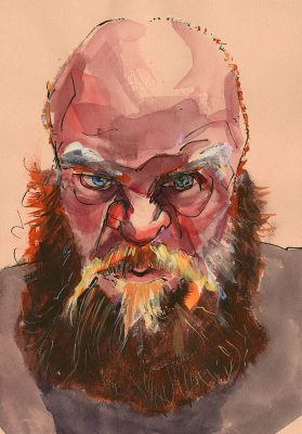
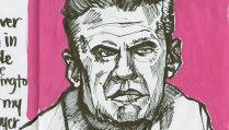
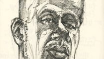
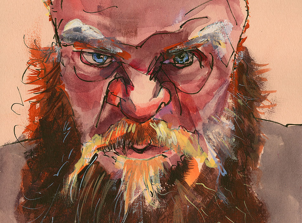
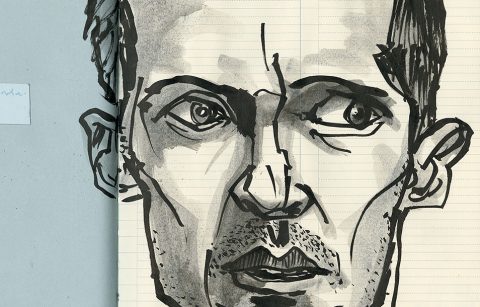
In the video review below I test this new paper, first by testing my favorite pens (start to 37 minutes) and then by doing a sketch (yes, a man with a beard) and painting it with layers of transparent and opaque watercolor.
Note: this painting uses tube watercolor paint. I simply used it opaquely (with a little bit of white gouache where I needed some white). If you would like to see more videos of me painting and chatting about art materials and drawing practice please check out my subscription blog, Roz-Interim, over at Patreon.
Keep scrolling to the end of this post if you want to see the video!
What Do I Like About This Paper?
First off realize that this is not the toned paper drawing books that Hahnemühle has been producing. Those have drawing paper in them and a more traditional paper color and value.
I’m writing about their Toned Watercolor Sketchbooks!
There are two key things I really like about the paper in these books.
First the colors they selected aren’t really tones like traditional toned papers that are meant to provide the halftone in your value range. Hahnemühle uses what I would call “tints.” The beige of the “tan” sketchbook is very peachy. This page color is significant enough that it lends flavor to the sketch you work on it, but light enough in value that it imparts a glow—announcing a temperature as if you glazed your colors and it was the first glaze you put down. If you live in the southwest US or are desert adjacent anywhere this will be a fun book for landscapes.
The gray paper has a lovely periwinkle cast to it. That is my all time favorite color. I think urban sketchers and architects will love the cool temperature of that page color, but it’s still fun for portraits and other subjects.
The second quality of this paper that I really like is that it is sized for watercolor.
Really! I painted on it and “poked” at it as I do when I’m testing a new paper. It stood up to everything I threw at it.
OK, there’s a third thing I like about this paper—it’s a smooth textured paper. There is a slight tooth and texture to it, but it’s almost smooth. Except for the lightest pressure strokes from my finest tipped pigment liner I had no trouble getting smooth lines on this paper. Yet there is enough drag from the slight tooth and the sizing that if you want your strokes to have a dry-brush look you can achieve interesting texture.
You can see my ink tests in detail in the video. Also in the video you’ll see me sketch and paint a portrait in about an hour.
If you work in watercolor, gouache, or mixed media, I think this is really a book you need to check out. It’s a sturdy book and I go over the structure’s features in the video, as well as list the sizes it comes in.
What I’m Unhappy About
I don’t like landscape books. When you have 3 weeks sometime I’ll tell you why. The main reason is I stand when I sketch and a landscape format book flops about in my arms when I sketch.
OK, that’s not the main reason. I simply don’t like the landscape format for anything other than film.
I like portrait orientation.
Sure I can make do with a square sketchbook. But this book comes only in a 5.75 inch square and that’s too small for me! I need an 8 inch or a 10 inch square.
What I really need is an 8.75 x 11.75 inch (or whatever the LARGE Portrait Nostalgie is) book filled with this paper.
I hope someone from Hahnemühle reads this and rolls out new sizes for “the rest of us.”
Full sheets would be great too, but I know I’m probably dreaming there, so I would be really excited about a 9 x 12 inch pad! Gulp, yes, Roz typed the “pad” word. She must really like this paper.
Disclaimer: I didn’t receive any financial consideration for this review. Darin at Wet Paint was just trying to keep me out of trouble during the pandemic. He lent me the store tester copies. I think his action worked, though we’d have to ask Dick to weigh in on my troublesome level. Now, more than ever it is important to support local, independent art supply stores, and my favorite is Wet Paint, so I suggest you call them up and order your book(s) today. They can mail them to you or make them available for curbside pickup.
You can watch my video review below, or if the embedding doesn’t work, click here.
200321-Roz Stendahl-testing-hahnemuhle-toned-Watercolor-paper from Roz Stendahl on Vimeo.

Looks like this would be a great “tinted” mixed media paper? Does the “Tan” peachy colour lean more to pinks or yellows? Would it work with sanguine, terra cotta, sepia and browns? It’s so hard to judge colour on the computer monitor. Does this paper have more or less texture than the Strathmore Series 500 Mixed Media paper? It’s not often you whole heartedly endorse a paper (minus the size caveat :o)!!!!
Paul, the “tan” paper is definitely a PEACHY leaning. And for me that means more to pink than yellow, though yellows will go well with it. It will work with all the earthtones you listed. I understand about the monitor thing. I didn’t look right when I was shooting it. Even the Strathmore didn’t look warm enough. The final view of the sketch shows more how it is peachy, but then it depends on how your monitor is set up so I’m glad you asked.
I would say that the texture is similar to the Strathmore 500 Mixed media paper, but it is “stiffer” in feel and response. Because of that it is going to be less fun to work with color pencil on it than the Strathmore (to my mind, and I think probably yours), but it’s still good for CP. And also for soluble wax and of course gouache.
Yep I was pretty happy when I was testing this paper and going along and discovering things about it. But I do need a LARGE portrait orientation sketchbook, or at least large sheets so I can bind my own! It’s always something with me isn’t it?!
Thanks Roz. One more paper to add to my list for experimentation!