
Update October 25, 2023: I misplaced my blues when adding in my color suggestions please check out the corrections. I added some additional reasons as to my choices and expanded choices. Apologies if I confused anyone.
I wanted to talk about patience in watercolor painting today. It’s something my students have the most difficulty with when working in watercolor. It’s something that I abandon when working with live subjects when I’m out and about. There are times when you just need to get the color down.
One of the things I’m always telling my students is that the more they practice the more they will get the hang of how much water to use and how long to wait.
You can tell someone that, and you can tell someone how feeling the paper and finding it still cool to the touch means it isn’t dry yet. But telling someone all of that is no substitution for them working through the process time and time again.
They are still frustrated; and some are so frustrated they walk away from watercolor.
I find that incredibly sad and have tried hard to keep that from happening as a teacher.
I wish there was a magic wand option.
Since there isn’t, as a teacher on the other side of this learning process I can still do more than remind the students of the virtues of patience.
I can also make suggestions on what they can do to have better results even when they are impatient.
First, Use Artist Quality Paints
I cannot count the number to times I learn that frustrated students are using sub-par watercolors. I’ve seen video reviews by artists pushing Cotman Watercolors because Winsor & Newton makes them.
Look, practically every manufacturer of paint has STUDENT, SCHOLAR, or ACADEMY grade paints. (They have recently made understanding what is artist quality by using the word “professional” instead of “artist” and not all brands use those terms in a uniform way.)
Van Gogh watercolors are another student brand from a company that makes other lines of greater quality.
When you buy an artist quality paint what you are getting is better ingredients all around. Better pigments, higher pigment load within an individual paint (which will make coverage and vibrancy simple), less fillers, quality binders (in most cases quality gum Arabic, but some quality brands have moved to quality water soluble synthetic binders).
You get the idea. So why is all this better?
If you try to take a pan watercolor set like Cotman or Van Gogh and pick up color it takes some effort. If you then try to pull color from artist quality pans from Schmincke or Sennelier the color release is immediate and intense.
People tell me all the time that they can’t afford artist quality paints.
You cannot afford to not buy artist quality paints.
From the first stroke of painting you’re going to experience less frustration and more fun. You’ll learn how to apply REAL and rich paint to your paintings. Meaning those paintings will be rich in color.
It will take you less time to pull color from a pan of artist quality paint and this will speed up your painting when painting from life or urban sketching.
Tubes of student grade paints may seem like an easier out—but they still have the inferior ingredients, so when you use them you’ll have the same frustrating experience.
Some brands even use dyes in their paints to compensate for lower quality pigments. The paintings look vibrant because of the dyes. But dyes fade, even when not exposed to light. (I’ll let you sit with that.)
Your time is your most valuable asset. Learning to paint with watercolors takes time. The time it takes to learn to paint delicious paintings with rich colors is vastly shorter when you learn with artist quality paints—and you don’t have to unlearn bad habits of media handling.
If you want to progress with watercolor stop listening to all the YouTube teachers who push inexpensive, student brands on their viewers. Learn with a quality brand.
I Recommend the Following Brands
Daniel Smith Watercolor in tubes (I don’t care for their pans. I make my own pans from the tube color, described elsewhere numerous times here on my blog).

Schmincke Horadam Watercolor Pans (I also like their tube Horadam watercolor line, both are their top line, not student, but I bought the pans when no other company was making factory pans at a quality I needed. I could buy tubes of their paint, but I like using these factory made pans.)
M. Graham Watercolor in tubes. I originally tested these because I needed quality paint for the botanical illustration classes I was teaching—and Daniel Smith paints were only available mail order and were more expensive. I’ve heard stories about about people being chased by bugs because of the honey in the paint. I sketched in the wilderness with these for a decade and never saw a bug for that reason! But these are less likely to dry on your palette because of their formulation. I haven’t had this issue, but if you’re in a humid area this may be a consideration.
You’ll sometimes see me sketch in a video with Grumbacher Finest. These are Grumbacher’s artist watercolors. I don’t even know if they are available any more. I have some I still like to use. Grumbacher Academy is a STUDENT line and not recommended.
Sennelier Pans—I have a friend who swears by these.
QoR from Golden are artist quality and use a synthetic binder instead of gum Arabic. They work just like gum Arabic watercolors and you can use them together with your other artist quality watercolor paints. No problem. I’ve tested some of them and they are lovely paints but they don’t have a pigment range that gives me quite what I want, and I miss the smell of gum Arabic which is part of painting in watercolor for me. Still these are great paints.
Those are the only watercolor paints I would recommend you buy. All artist grade.
Before people ask I don’t recommend Holbein Watercolors because they are made in a different watercolor tradition, don’t contain ox gall, and have a different movement across the page, as needed by the tradition they were created for. I also find they have a lot of multiple pigment paints, which makes more complicated. But I have friends who do a lot of botanical illustration and don’t need some of the characteristics I like in a watercolor paint and they love these.
Update 10.23.23, 10 a.m.: I use them so infrequently I forgot to mention them—Winsor & Newton Professional line is what they now call their artist quality paint. (Avoid Cotman Watercolors as mentioned earlier.) I have a few Winsor & Newton Professional line TUBE colors leftover from a particular project. I either like the pigments, or I’m interested in using up the paint—so sometimes they come into a demo. It’s a good paint but I already have a lot of Daniel Smith Paint. Daniel Smith tube paint is superior to Winsor & Newton Tube paint when making your own home pans—Daniel Smith tube paint cracks less when you home dry it in pans. (I have written about my 1/3, 1/3, 1/3 fill side to side, dry each layer process many times.)
Additionally I sometimes demo with a watercolor paint from Richeson, but that’s mainly because I found it during the downsizing and wanted to use it up. It has been “lost” again so without the labeling specifics I can’t tell you what to look for, if they still make it. They do make a STUDENT grade paint which is labeled such on the set boxes. That is not the paint and I don’t recommend it. What you may see in my demos from time to time is that old artist quality paint I’m using up.
What You Need To Get Started
If you think it’s not affordable to buy artist quality paints you’re not taking into account your time and your learning process. You’re also buying into a vendor myth that you need a lot of colors.
You need exactly this:
A Warm Yellow (I’d pick a Hansa Yellow deep something skewing to orange, even an Indian Yellow, but that might be too extreme. For a long time I had Gamboge on all my palettes. Know there are lots of choices for this and the following colors.)
A Cool Yellow (I’d go with Lemon.)
A Warm Blue (French Ultramarine or Cobalt are the usual suspects here. I have to vote for my PB60, Indanthrone Blue, which is an oddball choice, but I love that it doesn’t have such a green leaning Schmincke formulations. QoR’s version is too green leaning for me.)
A Cool Blue (Phthalo Blue is the usual choice here. I like a Phthalo Blue Red Shade selection because again, I don’t like green leaning blues and the Phthalo Blue Red Shade pigments always make better, less neutralized lavender when mixed with cool reds. But a Phthalo Blue Red Shade isn’t going to give you the same range, especially for some of your sky colors. A couple years ago student got me to test Cerulean Blue Chromium and I have to say it’s growing on me. And I’m a total fan of Cobalt Azure from Schmincke. It gives me more neutralized lavenders, but they are so interesting with the granulation that I can’t resist.)
A Warm Red (Pyrrol Scarlett is a good one, also Permanent Red Light, Vermillion…tons to choose from. You want a red that is more on the orange side of things.)
A Cool Red (Everyone used to use Alizarin Crimson here, and that’s a fugitive color, but NOW there is Permanent Alizarin Crimson so knock yourself out. Some people use Quinacridone Red here. I confess that I love Daniel Smith’s Quinacridone Pink, yes Pink. It reads as a cool red until diluted and when diluted it’s yummy, and when mixed with warm, red-leaning blues it yields non-muddied lavenders, what’s not to love?)
You could stop there but I’m rather partial to the dark neutrals I get when I mix my PB60 with Burnt Sienna, so I also include that.
After you practice with this set of watercolors and use it to learn color theory. (Pick up a book by Stephen Quiller, or Nita Leland’s “Exploring Color: How to Use and Control Color in Your Paintings,” to name just a couple good ones.)
Once you’ve done that, say daily for a month, you’ll understand the colors you have and what they can do in mixes, you’ll also be able to handle your water levels because you’ve been practicing with quality paint. Then you’ll know, “wait, I really need a pre-mixed green because I’m drawn to paint landscapes,” or, “I saw Roz play with that secondary triad and I’d like to try that,” or “So and so uses this color so I’ll add it in and see how it goes.”
Now you’re building a palette that is affordable (because it’s not a ton of colors you’re never going to use) and you know how each works.
You’ll also know which of your “starter” colors aren’t quite working for you and because you’ve been using them daily you’ll just about be ready to order some replacements to test against them. It still keeps the costs down as you march closer and closer to the colors you want to see in your paintings.
This is less expensive than buying every trending set or new color!
Second, Use Less Water (and Real Brushes Whenever Possible)
I cannot count the number of times in a class I’ve had to go up to a student and quietly suggest to them that they use less water.
Even when using artist quality paints people insist on using too much water.
Think instead of the consistency of heavy cream, it sort of coats things. That’s a good place to start. You can add more water if you need something more dilute, but less is almost always more when it comes to water. (First washes may be more dilute but you still want to dilute the paint and have it on a brush that is not heavily wet because it dilutes the paint more.)
Here’s what you can do. Use your brush that is lightly wet but not dripping to pick up color from a pan (or tube paint blob) and place that color in a well on your palette. Keep bringing color there without adding more water. When you get a good bit of pigment there (depending on what you’re going to cover this will change) add a little bit of water to that pigment, creating a puddle that is the right consistency for your use. If you add too much water don’t worry, it will evaporate, you’ll just need to keep your eye on it. Start a new puddle in the mean time, or try to add more pigment without more water, but don’t do this when you’re frustrated. BREATHE.
Whenever possible use a hair brush (real hair or synthetic doesn’t matter as much—in fact the synthetics are so good these days that it’s one place you can save a lot of money and still have a great painting experience.)
Whichever brush you use, get into the habit of either drying it out on a towel, squeezing it dry with a towel, or shaking it (as the wonderful Charles Reid used to do—hence all the splatters on his paintings). You’ll get a hang of what is right for you.
I like to put my paper towel at the base of the brush tip, next to the ferrule when there is too much water in my brush but I’ve already loaded the pigment. This wicks away the water but leaves most of the pigment on the tip of the brush.
Using waterbrushes can further frustrate you as they continuously feed water to the brush hairs. You can control it, but it’s a whole other learning curve. Students who’ve seen me sketch at the Fair, usually laugh a lot, because I go to great lengths to get the water level on the brush tip right, and I really am rough on those brushes. (The last less than 3 weeks for me if I’m sketching out regularly.)
If you’re trying to learn water control, use hair brushes (real or synthetic) to achieve this, and then master the waterbrush if you need to.
Third, Blot Your Brush, Blot Your Paper
As I just mentioned—use your paper towel to blot your brush and wick out excess water. But don’t be afraid or concerned about blotting your paper too.
If you put down a wash with too much water and it’s a quick sketch where perfect gradations of watercolor aren’t the goal, just blot up the paint with one press of your paper towel and apply a less dilute wash in that space. The still, but barely moist paper area will accept the new wash easily and you won’t have done much to disturb the sizing on the paper for future washes either.
(I will admit though, that I love simply swiping the color away with my paper towel, but then I like texture that says, “Not real, a painting.”)
Fourth, Work around Your Page in Non-contiguous Areas
Watch me or any artist who works in public painting from life and you’ll see something we all do—work around the page.
We aren’t forgetting something, or distracted. We have an idea of the breakdown of our paint layers in our mind and we are working on different areas while we let the wet areas dry.
This allows you to avoid the dreaded balloons and cauliflowers.
Those happen when you try to put wet pigment onto wet or moist paper. The brush, which is wetter, pushes the pigment on the paper out of the way and you’re left with those blossoms.
Worse, from my perspective is you just pushed the pigment you had down there away and now you have to work harder to get contrast.
If you find you had great contrast in an area and then it all lightened up this means you’ve gone in too soon with more wet paint. This is the number one reason you need to be patient to watercolor!!!
Stop, Breathe, Look, Adjust
The bottom line in watercolor, after you step up and buy a limited number of quality paints and a couple decent brushes and some good paper (don’t get me started that’s a whole other discussion) is that you do need to stop and breathe every so often to avoid going back into the water too soon.
Stopping and breathing allows you to look back at your subject or the scene you were sketching to reassess what you might be missing in your drawing. Stopping and breathing gives you time to LOOK and see if you have really got the focal point shining forth.
Looking allows you to give the entire painting a once over to see what you’ve omitted, forgotten (because you were working on another aspect), or need to beef up—like your contrast.
While you are looking and breathing the paper and the paint are drying.
And if you have been practicing water management as I’ve suggested above, then there is less paint on the paper and things are drying faster. (Except all bets are off if you’re sketching in the Minnesota State Fair animal barns on a hot and humid day in August!)
And so that stopping to breathe and look serves a double purpose. Not only does it help you hold on and wait patiently, it gives you a time lapse in which the physical things you need to occur on your page happen.
Then you’ll learn you can go back in, pretty much with impunity!
Finally
There is one other thing a teacher of watercolor can do—remind the student that the payoff for having the patience to learn the equation of water-paper-air-temperature-drying is a growing satisfaction in the results. Understanding these aspects of watercolor brings an increased ability to lean into the fun and exciting aspects of building contrast; using splashy, wild color; and approaching greater accuracy or dimension. All while still exploring joyous (often giddy) aspects of texturing available in watercolor.








A WHOLE introduction to watercolour course in a single blog post!!! Thanks for the reminders👍 .
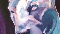
Thanks Paul, You know me, originally I had a very short post planned, around this portrait that I really enjoyed the results of, and then I started writing. I did have to go in this morning and add a little update as I’d “forgotten” to include a couple things. Now I’m walking away from the computer! Really. Right now. Not typing any more.
I feel called out😂. Just kidding but if I didn’t know that you schedule your blog posts in advance…. Timely reminders. I am getting to used to real brushes again after several months using a waterbrush, having to control the water and yes I use too much water. I can’t find my filberts.
Well I know you know that I’m an impatient sort too! I do try to work ahead in my blog posts 4 to 6 weeks, leaving a couple holes for things that suddenly pop into my mind. It’s because I like things to lead up to something usually. Like the posts I’ve been doing on doodles. And it’s also because I like to work well in advance of deadlines. But I have been playing catch up with all the other stuff going on recently. You’ll have deja vu however when we start in on grids on Patreon! It’s pretty funny.
I am concerned however, that you can’t find your filberts! That’s serious.
I was suggesting to someone in the Patreon group to use a hair dryer or heat gun to dry layers before going on. Have you tried that? When I’m really impatient I do that and it speeds things up. (Not good for the Fair of course, but at home.) The nice thing about that, is when we have limited time, if we use the dryer we actually have more time to get the contrast and colors built up. See if that helps.
And keep your paper towel handy. Let’s see if we can come up with a drill for how you approach water, so it’s automatic. I’ll have Dick watch me and take notes. I do things automatically with water now and don’t really think about it so trying to write about it now I just go blank.
I am just getting back into watercolors after a 7- (or so) year break, and I found this post very informative! Thanks, as always, Roz, for sharing your experience and wisdom!