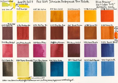
Normally when I catch an error in one of my posts I simply fix it in the post and put an update note at the top of the post. I make errors for all sorts of reasons. But in my “Patience in Watercolor” post from October 23 I simply didn’t go back and reread it before posting!
Originally the post had no specific color selections beyond, use warm and cool primaries. When I quickly put some in at the last moment I didn’t check myself. Some of my color choices on my regular palette aren’t those that are typically recommended so I started listing colors hastily.
Because this is such an important detail I went into the original post and changed and expanded the selection of blue pigments. And added the notice at the top of the post.
And because some of you may have already read the post and been scratching your heads about the Indanthrone blue mis-categorized I’m posting this correction as a standalone post. Indanthrone blue is a warm blue.
Here is that correction:
A Warm Blue (French Ultramarine or Cobalt are the usual suspects here. I have to vote for my PB60, Indanthrone Blue, which is an oddball choice, but I love that it doesn’t have such a green leaning Schmincke formulations. QoR’s version is too green leaning for me.)
A Cool Blue (Phthalo Blue is the usual choice here. I like a Phthalo Blue Red Shade selection because again, I don’t like green leaning blues and the Phthalo Blue Red Shade pigments always make brighter, less neutralized lavender when mixed with cool reds. But a Phthalo Blue Red Shade isn’t going to give you the same range, especially for some of your sky colors. A couple years ago student urged me to test Cerulean Blue Chromium and I have to say it’s growing on me. I’m also a total fan of Cobalt Azure from Schmincke. It gives me more neutralized lavenders than my other blues do, but those lavenders are so interesting with the granulation that I can’t resist.)
So apologies for any confusion my original posting caused. Indanthrone Blue is a warm blue and my favorite blue in my palette. (And it is the perfect complement to Burnt Sienna, resulting in rich dark neutrals that I can skew warm or cool; creating the perfect Malamute grey of course.)
One of the things to keep in mind when choosing pigments is that they exist in relationship to each other. This is not an excuse for my brain fart, but I want to use this error as a moment for more learning.
Some artists might elect to have all their blues coming from what is considered the Warm Blue range, and then within that choice of blues they would designate one of the blues warmer or cooler than the other and use them as such. Their work then has a different dynamic range than artists working with clearly distinct warm and cool blues. (I tend, historically to fall into this group—most of my blues were from the warm range. In the past several years I have been cool-blue curious. It’s something to explore.)
It’s important to keep this in mind because it will influence how you choose pigments and also how you use them in your work.
As mentioned, in the past I tended to stay away from the green-leaning blues, though I have Phthalo Turquoise on my palette most times, and use it for my green. There are personal historical reasons for including Phthalo Turquoise. The main reason, however, is I live in Minnesota. Even in the city you can’t turn around without seeing a rafter of turkeys milling about, or walking purposefully into traffic! The variants of wild turkey plumage we get in Minnesota are captured easily with Phthalo Turquoise and Transparent Orange. So I keep those colors handy.
To make this more complicated, or perhaps more seemingly nonsensical, I’m reminded of a story I’ve shared with my color theory students and maybe even on this blog before, but it bears repeating.
I gave a demo at Wet Paint years ago in which I touched on some color theory issues—the talk might have been entirely about color theory, I don’t recall; often my talks about any topic end up being about color theory.
After the talk a woman came up to me and asked me quite forcefully to specifically list the pigments needed to teach color theory. I started to ask a couple qualifying questions because there are a lot of ways I could skew the list, and I like to give thorough answers.
Her voice got louder and more frustrated—she wanted the definitive list.
Being a good guest speaker I suggested a couple color theory books that I knew Wet Paint had on hand for sale, thinking that would help her see the options and make her choices based on her own artistic criteria and even her preferred subject matter.
One of the sales people brought the books out and I pointed quickly to a list in each. But since the lists disagreed as to particulars the woman, almost screaming now, told me that she was teaching a color theory class on Wednesday (four days hence) and she needed to know the definitive list.
Wow.
I gave her a list. Is it the list I use? Nope, but it was the most “traditional” list I could think of that would give her and her students a great starting point, and not confuse them.
The takeaway here is of course, learn color theory before you teach it.
But more important, realize that you can customize your choices to suit your needs and preferences.
I do start my color theory students on a fairly “non-controversial” range of colors, with full disclosure that we aren’t using my palette to start with. I lead them through the exercises they need to develop an understanding of the relationship of the colors and what all those colors can do. Then as the class progresses we start taking apart my palette.
I explain my choices and demo what they can do with my palette that is different and essential to me but which can’t be as easily done with the “non-controversial” range they started with. Because they have been working with that range they understand what color can do.
They have a foundational understanding from which we can discuss and explore.
My goal for the class, which I always state on day one, is for them to start with a few pigments, learn to mix and understand how things fit together, and identify where there are “holes” in color choice that matter to them. They then have the tools to test colors and figure out what direction they want to go for a personalized palette. And that’s my goal, I want them to understand color theory so that they can have fun with it and use color the way they want to use it; and constantly evolve their palette in a non-trendy, personalized way, long after I’ve left the scene.
Color theory is about nuances—which nuances matter to you in your painting.
I spent years using Gamboge which is very orange leaning, as my warm yellow on my palette. It was so distant from my cool yellow that I had huge range between them. But the orange leaning caused other ripple effects in my mixing. And when I was teaching color theory for botanical artists I used a more conventional range of yellows, though I did show them what Gamboge could do for them in some of their really dark foliage.
When you’re selecting your warm and cool primaries for your initial foray into watercolor and color theory I strongly recommend that you start with some “conventional” colors you can find recommended in all the good books on color theory (which I’ve listed before).
So in Monday’s post I stayed pretty “conventional” when I decided to drop in my suggestions and make the list more useful. (The entire post was initially envisioned as about 4 paragraphs!)
It doesn’t explain my error—that was just me being hasty to somehow work in my favorite blue.
But now you have a correction so you can round up your colors confidently.
Please do some painting today. Enjoy the nuances you get from your palette selection.
















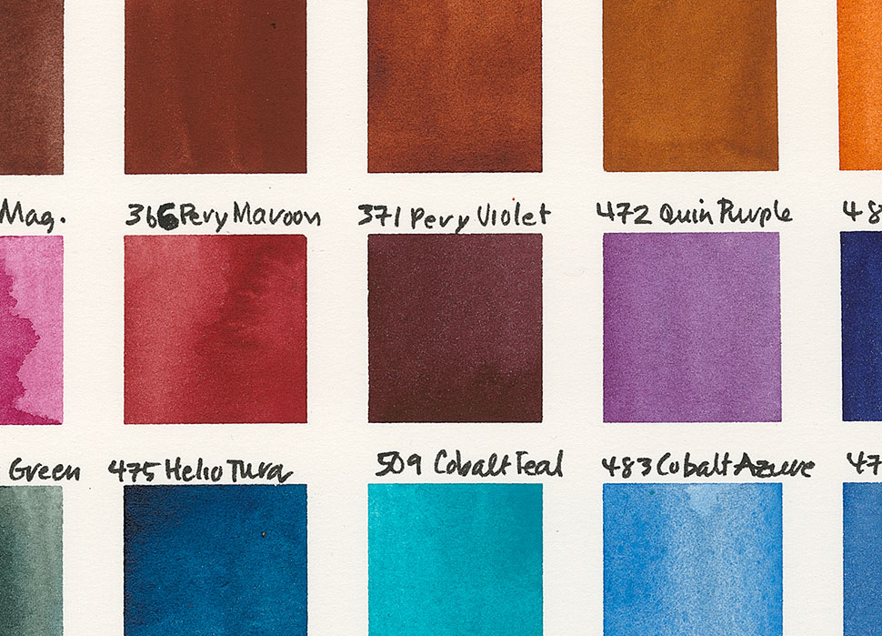


I am currently taking a watercolor class and completely redid my previously “conventional” palette. It’s the first time I’m really excited about my palette because it feels like it’s really mine instead of a “recipe” from a book or an instructor’s list. Although I haven’t painted much over the years, I have studied a lot of color theory using colored pencils, and now I’m just applying what I learned (about how I like to use color) to paints. I am now learning about how various pigments get along (or don’t) with others, but it really helps that I understand how colors work together in general.
I came back to watercolor after a long sojourn in color pencils (for a host of reasons—they were my coloring medium in childhood). I was frustrated by the time things took, and the multiple pigment colors. There weren’t single pigment color pencils back then, neatly labeled for us. I wouldn’t trade away a moment of the fun I had with color pencils and I still use them for various approaches, but when I got my first Niji water brush and could take my watercolors out of the studio into the streets in 1999 it was just too easy to not go forward, not have to juggle multiple pencils in my hand, quickly shade the side of an animal with one stroke; and of course know what was in each tube of paint. So I’m excited for you to be diving into watercolor. I think you’ll find a lot of benefits to using it for your urban sketching. And you can keep some color pencils on hand to add on top of the dry watercolor if you feel so inclined because they work so well together!
And I’m really glad that you’ve customized your watercolor palette. We all see with different eyes and knowing how to make adjustments to the palette so we can do with paint what our eyes see is a huge deal. Have fun with your new tools!
P.S. I just read your book list … I love Jeanne Dobie’s book, too. Another favorite is Exploring Color Workshop, by Nita Leland.
I love Leland’s Exploring Color. I think the “Workshop” is a later book that you can actually work in. (My books are still in storage and I don’t know which of her books I have because her titles are so similar.)
She has a great exercise in Exploring Color that I make all my color students do. It’s an exercise in split primaries, where you keep your mixes within quadrants of color. Working to stay in those quadrants and then working with going into the adjacent quadrants while doing a different sketch with only one switch up in paint really helps the students to a very quick and permanent aha moment for understanding how a green leaning blue can never make a clean, clear purple mixed with any red, because of the complementary component and all other revelations of a similar nature.
The exercise may be in the Workshop book too? But I love that exercise because of how quickly and completely it allows people to see in action what is otherwise just a bunch of words.
Dobie’s book has the same finesse as her art. She is such a fantastic painter in watercolor. She really does understand how to make color sing!