I hear all sorts of things from my journaling students. “How much negative space should I leave on my journal spread?” “How much space should surround my focal point?” “How much text and how much more illustration should I put on my page spread?” “How should I arrange these 5 things on my page spread to ‘even out’ the negative space?” And so on.
First the obvious thing wrong in each of these questions: “should” doesn’t pertain in journaling. You’re in charge. You and your own aesthetic sense. Your style. Your preferences.
Sometimes there are “needs” that are useful to follow compositionally, but there are no shoulds.
What’s an example of a “need.”
Well I might need to keep a plain background so as to not over confuse the viewer’s eye and draw that eye away from my focal point.
I might need to keep the contrast strong at my focal point to keep the viewer’s eye from drifting away. (I think that’s pretty much a need in any visual page, but that said I’m sure I could come up with at least one instance where it might not be necessary.)
I might need to limit my color palette so I don’t confuse the viewer’s eye with clashing colors.
My point is it’s important to talk about “needs” that are helping you attain goals, rather than wonder and worry about “shoulds.”
What I always tell my design students is that you need to know the rules of good design in order to break them more effectively. And I think that about sums it up.
So when you are composing your journal pages, especially if you’re doing it on the fly while sketching in public, take a moment to think about balance of light and dark (Notan) and how all that will work with the subject on your spread. Take a moment to think about margins and whether you want to leave them or have your art bleed off (extend past) the page edges.
In addition, I like to suggest that you ponder the idea of the “rule of thirds.”
Divide your page, or your page spread if you’re treating the spread as the full-extent of the image, into thirds horizontally and vertically. This gives you four intersection points. Placing a focal point at one of those intersections is going to go a long way to creating the most pleasing composition.
If you think about those few things for just a moment before you dive in, you’ll immediately have pages that you feel happier with.
Without all the guilt of the “shoulds.”
My Take on Negative Space
Negative space is the space surrounding your subject; everything that is not the subject. A silhouette clearly shows you that the negative space is all around it. Sometimes a figure might have arms akimbo and there will be negative space enclosed by the armpit down to where the hand touches the body. (Or a chair might have an open back with spaces between bands of wood—those spaces would be negative space.) So there can also be “interior” negative spaces.
Negative space is also called white space, but it doesn’t have to be white. You can float a color in it or fill it with pattern. Again your choice. But it remains negative space because it is outside the bounds of the positive space—your subject. (I also tell my students to find other areas in their positive space where they can work out the negative space around a given internal shape—so in an ear for instance there is the full ear as a positive space with the negative space of the head around it—but in addition you can break down the various spaces within the ear as negative and positive spaces in relation to each other. This helps to get shadow shapes and value areas accurately positioned, angled, and sized.)
I like to use negative space to correct my drawings. If I find that my drawing is way off the first thing I do is check the negative space. If I get the proportions and angles of my negative space accurately then the drawing falls into place. (Sometimes I’m working too fast to notice that I’m in the weeds so this doesn’t always work—but I can safely say that every time I’ve paused to consider negative space I’ve been able to improve my drawing. So keep that in mind if your angles and proportions are going nutty.)
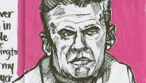
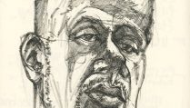
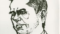
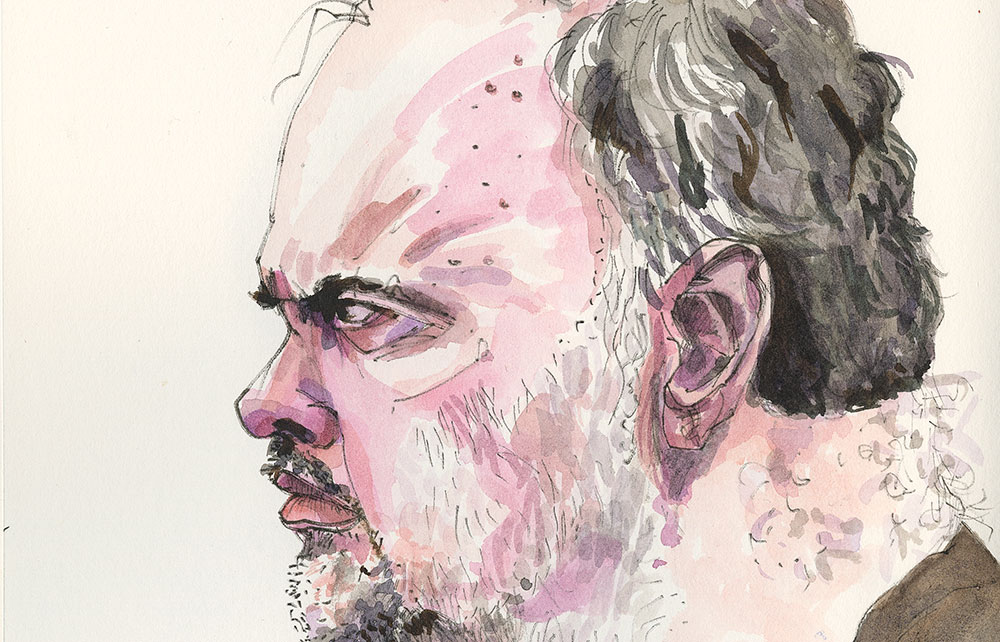
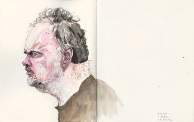
How you balance your negative space is up to you. I do encourage you to think about it. For instance, if I had drawn “not Rainn Wilson” more to the left, there would have been too much negative space on the recto page. And that’s saying something because the recto page is almost all blank here already.
Of course part of why that would look unbalanced to me is it would be a total tossing out of the rule of thirds. As it stands right now the eyes, which are the focal point, are pretty close to one of those “rule of thirds” sweet spots I mentioned before.
Now if I had decided before I started sketching that I was going to do another face on the recto page, then I could easily “get away with” moving the face over to the left. I’m using each page individually at that point in regards to rule of thirds (and not using the entire spread as a single entity).
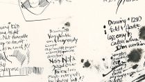
But if you come over and sit down and start going through my journals you’ll immediately notice a couple of things. I leave a lot of white space like what you see today.
I do this because I like the balance of it, and I do it because I’m probably going to journal in the negative space.
And so journaling in the “negative spaces” is the second thing you’ll see a lot of in my journals.
I think of the journal page spread a series of potential columns that I can assign for illustration space or writing space. Sometimes the writing is in a narrow column like a magazine sidebar. Sometimes the writing is in a large column down the page and there are small illustrations in the “margins”—i.e., in columns that are narrower and at the outside edges of the page, but inside the “live area” of the page which is limited by the margin space I’m leaving all around the page or spread.
Confusing? Not if you think about it for a moment. Basically I’ve been busy all my life designing books and magazines so all this stuff comes automatically to me. And I choose when and if I want to pay attention to it.
I never ask myself if I “should do something” because that would probably be the day that I stopped my almost six-decade long run of keeping a journal.
It’s got to be fun.
That’s what I want to impress upon you.
So give up “shoulds” and start saying, “What if I did…?” when you sit down to sketch.
Sure you’re going to really mess up some pages, but you’re going to learn what it is you like to see in the way a page is made up—what you think is visually balanced.
That’s really what keeping a journal is about—what you think; and your journey to work out what that is.
