 A few years ago I was asked to create an illustrated love letter for a show of such letters at a local gallery.
At the time I wasn’t traveling much.
For me a really good love letter requires time and distance to ferment.
I chose instead to write a love note to Dick about the things I love in a hierarchy which included rating my love for him, after missing him for a short business trip.
Recently while going through my digital files (still trying to rebuild them) I found the letter and it’s a happy bit of synchronicity because I’d been talking on my Patreon Blog Roz Interim about my favorite brush: the Filbert.
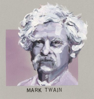
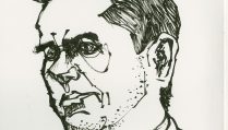
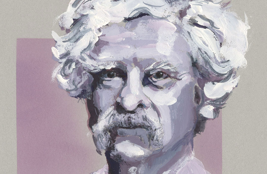
Here today, I wanted to show this small portrait of Mark Twain (which was part of the love letter) and write for a moment about brush forensics. (He’s about 2.5 inches square.)
Sometimes you see something that an artist did in a painting that you see in a gallery (or a really good reproduction in a book) and you might wonder how he or she “did that,” whatever “that” was which attracted your attention.
That’s the first step to developing an idea of what it is that you want to use as a tool to get a particular stroke or look down on the page—understanding the visual vocabulary of previous artists. It helps you understand what is or isn’t fruitful in your own artistic vision.
Close looking at the artwork allows you to see something about the artist’s habitual brush strokes (or “signature”) and the way in which that artist handles the paint (or other medium). Close examination also helps you understand how an artist brings your eye to the focal point with use of strokes, texture, color, color temperature, contrast, and so on.
Even if you aren’t an accomplished artist, or even a painter at all, you can use your eyes to discover something about how the artist worked. I try to get my students to practice this approach when they spend time in museums. For me this is when art really comes alive because we are having a conversation with the artist.
You might not spend hours standing in front of a 3 x 5 foot Lars Lerin watercolor with your friend Diane trying to work out which black watercolor pigments and black inks he’s using—but even a few extra minutes of close looking will start to tell you a story. As a viewer of the art this will increase your appreciation and enjoyment. It might raise questions that you’ll need to research or ask other artists about. As an artist you might also find new things that you’ll need to research but having painted you’ll have a better idea what you’re looking at.
So here’s a little breakdown to get you started.
Mark Twain Dissected
Initial Clues
First just to get it out of the way, some things you might not know but the more you look at art the more you would recognize and realize—the paper is a gray toned printmaking paper which has a soft surface, a lot of tooth. I mention this because some people use pastels on such a paper, but here we see with the stamped caption that it takes rubber stamp in really well.
Knowing that, even if you didn’t know me as an artist who spent over fifteen years involved in mail art, and even longer involved in rubber stamp art, you begin to wonder about that background lavender color and how it is “cloudy” and not stroked. You might, if you understand airbrushing think, that’s airbrushing. But because there is other evidence of rubber stamping on the piece I encourage you, instead of thinking zebras when you hear hoofbeats to think horses—and see this as evidence of more stamp ink. And that is in fact what it is.
After the portrait was completed I put a mask on the face. I traced the sketch and cut the mask from tracing paper; held it in place at the top and bottom, outside of the “box” area with my fingers and a bit of artist’s tape. Then I applied the rubber stamp ink by using one of those petal shaped pads you can stroke over paper for smooth even ink coverage. You see me do this all the time in my visual journals; though sometimes there I make a point to make each stroke visible.
So let’s ignore that background for now which is the “odd ball” stuff, and look at the portrait.
One of the first things I always look for is the original material(s) used in the initial drawing. This means I need to scan the piece to see what is peeking out if there is paint or other medium covering the initial sketch. Well I can find gray paper peeking out in the eyes and the forehead below the hairline, and near the ear, but I have to really look for remnants of the drawing.
If you don’t know the artist and the working methods they employ this is the only clue you’re going to have about how the sketch/painting started. Sometimes the initial drawing can be completely covered.
In that instance people who know me might be fooled into thinking that I sketched in brush pen first (which is my usual mode) and then covered the ink with the gouache. But that would be wrong.
Often when I have to do a more finished piece (even if it is going to be a quick sketch like this one) I work in color pencil or graphite first. I don’t erase because that can damage the paper surface, but I sometimes gently press a piece of low tack drawing tape over the pencil lines to pick up excess graphite or color if I want to minimize a line.
I’ll save you the searching here and point you to the left (our left) shoulder line. You can see a bit of graphite peeking through the light paint there.
So pencil is the initial drawing. But what about those crisp, frame edges? That’s going to be either artist’s tape or Frisket masking. Either will give you that look. I’ll just tell you I used tape. I marked off three sides but not the top. I drew in the face with graphite, lightly, knowing all the detail would be in the painting; then I tore back the tape on the right to just about where I knew the hair would start, and on the top of the box I placed tape to just into the hair at the top.
After I finished painting I would use the previously mentioned mask to cover the painted face and so I could lay in the rubber stamp ink background. Then I would remove the tape, and do the final strokes of the portrait on the hair meeting the top edge of the framing box and the hair meeting the right side of the box.
If you haven’t been through a painting process with frames and backgrounds and such this is something you might puzzle endlessly about so I’ve just spelled it out for you. Does everyone do it exactly this way? No, some might tape, lay the background over the whole space, and then paint. But here’s a big clue, the edge on the left side of the face where some of the paper color is coming through when the mask slipped. Not enough? An even bigger clue, in the neck above the white color, magenta, a gray space (very thin) and then a lavender. That gray is the paper color. That rules out starting with a box of complete background color.
Additionally if someone knew about my background with rubber stamps they would immediately assume the approach I just described, because it’s standard in rubber stamping.
The Painting
Now if we look at the portrait itself there are things you can see whether you know how I work or not.
Which colors went on first—look at the dark colors, there are lighter colors over all the dark colors except 2 places in the hair and these can be explained by last minute “doctoring” of the contrast.
So we know that after I did the initial pencil sketch I put in my dark colors all along left side, through the eyes, and on the right. We also know, if we look closely that there is color in those darks, no black. So now we know I am working with a value range of purple to lavender, with white highlights.
We can then look over the rest of the painting and see that this approach of lighter colors on top is followed throughout (with one exception I’ll explain in a moment).
Let’s look at the strokes and see what made them. We can see broad areas on the cheek. From the texture that right plane tells us it was put down in 3 strokes. The brush then was reloaded and there is a sort of “J” stroke added next to the lighter skin.
You can now look at the entire portrait and see lots of brushstrokes that are wide but have a round scalloped end, just like a Filbert! Look for instance at the white-ish highlight on the right temple: four short Filbert strokes stacked one on top of each other to make the height needed. And we know I started just above the eye because that’s where the paint is thickest and cleanest. By the time I reach the hair line I’ve picked up a little bit of the lilac that was already down on that section of the paper, but I also deposited the last bit of clean white at the hair line, by tilting the edge of the brush down before lifting.
It probably would help if you knew I’m right handed, but then it would add confusion because I frequently paint with both hands at the same time, or just with the left hand—I don’t consider myself ambidextrous. I just like to get both my hands in there and move the paint around.
It’s like cooking. It sometimes works better if you do an action and follow or simultaneously engage with the other hand. So whether you’re kneading bread, flipping and stirring things in a pot, or painting, it seems most fun for me to paint with both hands. Knowing this about an artist can help you ferret out more clues to their working approach. Or help you discover which single hand it is they paint with. (By looking at the direction of strokes—where they start and where they end. Then you just have to be alert to the fact that a lot of illustrators turn their work upside down upon occasion and continue working with only one hand…)
Something else the effort of starting to pick out these strokes will tell you—when I have a color on my brush I place it around the painting at different places where the same value or color exists. So that purple cheek on the right—that color is seen at the bridge of the nose, the forehead, and the opposite cheek just over the darkest bit on the left.
You can also see the Filbert’s curved tip in the mid-tone color placed in dry brush over the top of white highlights near the hair-part at the top right in his hair. This isn’t a break from working dark to light. This is obviously a darker value added over a light value at the end of the session. It’s a decision to knock back that one highlight or in this instance, to get the granular dry-brush texture on top and make the white sparkle a bit.
Now that you know what’s going on you can start to see all the other Filbert strokes. Some are flat, some are made by turning the brush on its side. Even they still have a telltale ending or beginning. Some are thinner than you think possible for the brush width size shown in the most obvious strokes—well I have several sizes of Filbert to explain that. Some of the thinnest lines are simply put in with the edge of a smaller Filbert.
Just before doing that dry-brush texture on the “hair-part” it was time to put in the white strokes everywhere. Those white strokes are of course on the top. Whether it’s a full bit of white on the right side of the chin, the telltale dab on the throat that screams FILBERT, or the heavy paint application in the hair. Noticing these and noticing the dark to light approach over all allows you to see which “dark” strokes were made after the white strokes with intention for some sort of necessary or desired effect.
What’s left to account for are the fine lines of dark value paint placed on top of the hair to try and restate any areas of contrast. These look pretty squiggly, and they are thin. For the most part they were also done with the Filbert as I’m a lazy painter and don’t change my brush as often as I probably need to! But with a good Filbert you can get a nice thin line of the edge of the brush body. The give away that these are still Filbert marks and strokes is that area of slightly darker than mid-tone darkness on the top left hair curl located about 1/8th inch in from the paper color. It starts with that Filbert tip shape at the bottom and goes to a thinner edge at the end.
Keep looking there. On the top edge of that entire shape there is another stroke, very thin, and ended with a point. This could be another Filbert stroke on the edge, or it could be a stroke from a small round brush. Sometimes at the very end of a painting I might go in and do ultra fine details with a small round. The tip off here, however is that the ends don’t always fade away to a nice sharp point as you can do with a round brush tip, but instead a blunted end. The blunted strokes, even the fine ones, are still the Filbert in action. Then there are a few very final strokes made with a round brush. Those are identifiable because of their fine-pointed beginnings and endings. They are my last statements of darker paint over the white, to suggest hair clump demarcation and value shifts.
Would it be a better sketch and a better likeness if I took time to switch my brushes sooner? Sure, but it wouldn’t be what I wanted to get on the page, and what I wanted to experiment with when using a Filbert.
An Invitation
Whether you paint or you simply enjoy looking at paintings I invite you to start looking more closely at the works you are fortunate to see in person. Pay attention to strokes, layering, the initial drawing if you can spot it. Look at how the artist uses color. Where do actual bits of unmixed color appear that give you hints to the basic palette used? Look in areas of dark neutrals to see the component pigments being mixed to achieve that color. Look at how the color temperature in the flesh of a face changes from cool to warm and back again. Just because a painting is an oil painting doesn’t mean you won’t see glazed, translucent passages. You might be able to see the grisaille underdrawing and underpainting (I’ll leave you to research that).
There are a thousand different things we can see when we look at a painting. One of the most fascinating things we can see is the process by which that piece came step by step to be on the page.
It matters that we look closely to see this process because often in great works of art close inspection of an artwork allows us to see the moment when the artist changed paths and went a different direction. When you see that you get goosebumps. You can feel the artist’s breathe on your cheek, whispering to you, “It makes sense doesn’t it?” or maybe quoting Maynard G. Krebs, “Cool, huh?”
And you know you’re having a direct conversation with someone who may have been dead for centuries, who wants to tell you a little something about light, dark, and living an observational life. They have worked hard to help you see what they see.
An Exercise
If you live in the Twin Cities and can get over to Mia (the Minneapolis Institute of Art now going by “Mia”) I encourage you to visit Jean-Léon Gérôme’s “The Carpet Merchant, painted c. 1887.
For all its in-person visual impact it is not a large painting, and the figures are not large. But the whole painting swells with details that demand your focus, and other details artfully moved out of clear focus because they are there to set the stage and only be seen as the eye sees—not everything in focus at once.
There is a man in a gray robe to the front right. His body is blocked by a man in a tan-ochre robe with a white turban. (That white turban is a lesson in fabric folds and light, as is the back of the tan-ochre coat.)
Look past the others only at the man with the white beard. You can spend hours staring just at the beard. You can learn everything you ever need to know about rendering hair by looking at that beard. First of course there is the anatomy of a bearded face. This isn’t some facial lump covered with nonsensical shapes of hair. The structure of the face is all there. And then the color values and temperatures of white hair—all there. And volume shown in space with light and form- and cast-shadows—all there. And the use of contrast to keep our focus on that face—all there.
Gérôme painted this scene almost 140 years ago. The lessons in seeing contained in just that beard are still as alive, rich, and useful as they were when he painted it. Seeing a great master’s lessons in seeing, an act we often take for granted, is the reward for observing closely, that glory of a beard that is so real it looks as if he painted every hair, but upon closer exploration you see he did nothing of the sort. Goosebumps. “Cool, huh?”



Wow… this is all fascinating, Roz! Thank you! Suggestion (if you ever give us another painting forensics, which I hope you will): Would you put another copy of the work closer to your analysis so that we won’t have to keep scrolling back up to the top of the page to view the work and then scroll back down to read your analysis? Thanks!
Tina, thanks for the suggestion. This was supposed to be a 2-paragraph post. HA! and so I just included the one image. Then when the text grew I didn’t have time to make section views of the image for the various “points of interest” and thought, “Well people will just open a new browser window and view the image in one and read in the other.” But maybe I’m the only one who does that?
Thanks for pushing on, even though it was inconvenient. What I really would have liked to do after I finished writing, is a video zooming in to different areas. But then I really didn’t have time for that either. Too much going on. Let’s see what short topic I can turn into a novel next!
Fantastic, information-dense post, Roz! Thanks for this.
Glad you found it useful Sharon!