I have just started testing Daler-Rowney’s Langton-Prestige Cold Press Watercolor paper. In the above video you can see my first experiments with it and my first thoughts.
If the video doesn’t play you can view it on Vimeo at this link.
Normally in my demonstration videos I include any photo reference or still life that I use for reference. Here because this video is about testing the paper I didn’t include the photo. (Sometimes there is a delay when I request permission from a muse on the Sktchy app to include their photos in my sketching videos. I wanted to get this demo out in June so I could start posting other tests on this paper.)
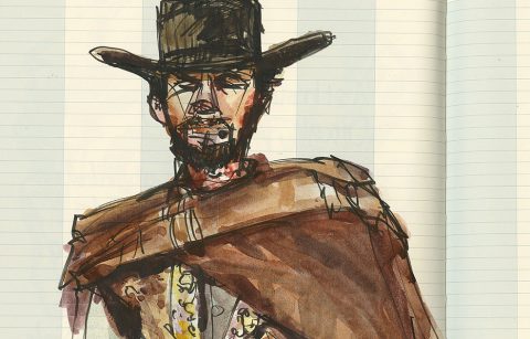
I know that many of you enjoy seeing the photo reference that I use when sketching. You can click here and see John Walton’s inspiration photo without having to go onto the Sktchy App. I was sketching his dad in the background.
In the video I mention that I’m using my Schmincke Pan Watercolor Palette. (You’ll see it.) These are factory made pans, the only brand of factory made pans I use. If you would like to know what pigments I’m using you can look at this post on the blog. I misspoke in the video and said it was the 2017 palette, but it is in fact the updated palette from October 2019.
Note that while Sepia is on that palette I rarely use it. It’s there to do monochromatic direct brush painting in life drawing—should I ever be able to go back to life drawing at the co-op! Also note that I sometimes put blobs of color on my mixing spaces if I’m doing something else, like a webinar where I’m talking about mixing specific colors. Or if I’ve run out of space on a china palette and the paint box is nearby and handy. Because of this you’ll see some blobs of paint in the mixing surface at the top of the palette. I’ve got a quin gold and an Indanthrone blue (both Daniel Smith, put out for another demo). I use the Indanthrone blue in some of my mixes in this sketch. Schmincke’s line includes two PB60 paints and I have one pan on this palette, but I used the DS simply because I’m trying to use up the paint and clean that area of my palette. I just don’t want to confuse you. Come to think of it the reason those two Daniel Smith tube paints are on the palette in the first place is probably because I was doing a demo and trying to show comparisons across brands for the same pigments. I love watching students’ heads explode at the results. Daniel Smith remains my favorite tube paint.
If you would like to see more painting demonstrations by me please subscribe to my Patreon blog here. I post a new demo each month, as well as creativity posts and additional video posts. If you join at the Tier 3 level you will also have access to a monthly webinar with me. Roz-Interim at Patreon has been up since December 2019 and that means there are over 19 demos (because some months I post more than one demo because I get transported by a theme). You see me paint with watercolor, with watercolor opaquely (which is the same technique I use with gouache I just have a lot of watercolor paint I’m using up right now), with ink wash, dip pen, other types of pens, and so on. At the end of last year we did a project challenge and a series of lectures on color theory. Right now I’m in month one of a two-month look at sketching dogs. And coming up in September I have a special series of videos to get people ready for InkTober with different ink approaches! You get the idea, a lot is happening over there, I hope you’ll check it out.
Things I Liked About the Langton-Prestige Watercolor Paper
This is a 140 lb. Cold Press watercolor paper. (Called “Not” in the UK instead of Cold Press.) I bought it in Pads and it still stayed relatively flat for that weight of paper.
It has a light cold press texture. It’s there, you notice it, but it’s not overly pronounced as some brands are. Additionally it is non-uniform and by that I mean you do NOT see a repeating pattern of texture on the surface as you do on lesser quality papers.
The paper is gelatin sized. Readers of the blog know that I prefer gelatin sizing to vegetable/starch and synthetic sizing, so this is a big plus. I prefer gelatin sizing because it allows me to move the paint around on the paper in ways that I enjoy—smoothly, quickly, evenly, without leaving the ghosting of strokes. (In the video note the jacket wash when I hold it up to the camera.)
I liked the way one of my favorite brush pens, the Sakura Pigma Professional Brush Pen FB moves quickly and easily across the gelatin sized surface without drag. I also was pleased to see that the ink dried quickly on the paper and retained its water-resistance. (I say more on this in the video.)
Also the texture of the paper was not so strident that it broke up my thin brush pen line. I appreciate that.
I found that the paper was very happy with my gouache strokes as well when I did the background. And the texture of this paper gives me a lot of options for painting opaquely either with watercolor or with gouache in the future.
The sheet is a bright, warm white. It’s 100 percent cotton fiber. Did I mention that it has gelatin sizing?
Things I Need to Look At Further Or Do a First Test On
I was a little surprised that the paper seemed to take a long time to dry. I work in a very dry environment and this paper seemed to take longer than similar papers. Part of this might be the sizing slowing the settling of the paint, but part of this might also be first time usage tentativeness on my part—in the real-time video I stop and talk about all manner of things and end up over-mixing my paints as I’m talking. I probably ended up using more water than I usually do. I will need to look at this in another session because I don’t want to have to restate colors. We’ll see. I’m not worried.
I didn’t try to lift any colors on this paper. At one point I put a wash down the nose and blotted right away as I didn’t want to do that. I did pick up some of the under-layer when I did that. I suspect that I will be able to lift color from this sheet, but I haven’t tested it so that information is for another day.
I have several more favorite pens and approaches that I’ll need to test before I decide if this is a favorite and recommended paper of mine. I will post other sketches I do on this paper going forward, with additional comments about these matters.
One Negative I Can’t Get Around
There is one negative I can’t get around—availability. No one locally carries this paper. I purchased my test pads from a source on Amazon from whom I got the last two pads. I don’t know if they will get more. There are other vendors on Amazon if you search the paper name who carry this paper in different page sizes and in blocks as well as pads. It will be a matter of whether or not you can justify the price. That’s something I’ll look at when I finish my testing.
If you live in the UK you’ll probably be able to get this paper from the corner art supply store at a reasonable price for a 100 percent cotton, quality paper. I suggest that you try some when your paper budget allows for a purchase. The rest of us will just have to look for it where we can.
UPDATE 6-11-21, 12:16 p.m. CDT
Last night I heard from my friend Paul in Canada that Jackson’s Art Supply in the UK had a sale on the Langton-Prestige paper that went through TODAY, June 11. It was 50% off or close to. He figured the cost of shipping would the same as buying it locally at suggested retail price, which he can’t do because no one carries it there either. Anyway, you might want to check this out if you’re eager to try the paper.
Pay Attention If You Purchase This Paper
If you purchase this paper pay particular attention to the name of the paper you are purchasing.
Langton is the name used for TWO LINES of paper from Daler-Rowney.
I tested the Langton-Prestige. That is their 100 percent cotton paper. It’s their top range paper.
The line that is simply called “Langton” is made from wood pulp and cotton. The website doesn’t specify what type of sizing is used on the Langton line. I suspect it might use a vegetable sizing or they would write that it also has a gelatin sizing.
Both paper lines come in Hot Press, Cold Press (Not), and Rough. I couldn’t find anyone selling the Hot Press (which I tend to prefer) in the US so I ended up testing the Cold Press.
The packaging and labeling of the two lines is VERY SIMILAR. The Langton-Prestige Line has the word “Prestige” on the front label, just below “The Langton.” The colors used on the pad and block covers are also more muted (periwinkle, orange, and light green), whereas the lower grade paper uses vibrant red, blue and green on their pad and block covers; and the word “Prestige” is absent.
Just be sure when you are ordering—if you see a price that is too good to be true it’s probably the lower end paper. OR it’s a much smaller size of pad or block of the high-end paper. (I almost was confused by the latter.)
Going forward I’ll keep you posted on the experiments I do with this paper.









Hi Roz, Time for Lunch? I would imagine that this paper is produced by St Cuthbert’s in England since both Daler and St Cuthbert are owned by FILA Arts. Might be interesting to compare those two papers side by side?
Joe, I thought this came through in my regular email. I sent you a note that way. Thanks so much for stopping by the blog.
Over the years I’ve come to rely on your unbiased and thoughrough reviews of art tools and media. You have saved me a ton of time and money. It has also resulted in wonderful explorations and dicoveries of favourite materials. If it passes the “Roz Test” there’s a very good chance I will love it too! Thanks for continuing to do these Roz, much appreciated.
To clarify: at least you saved me from wasting time and money on POOR QUALITY art products! Still spent time and money on good stuff though 😁👍.
I sort of took that as understood. Sadly the result of posting about materials is that people may way to buy them and that of course costs—but I know you use what you buy.
It’s always a plus to spend time working with the good stuff.
Thanks Paul. I’m glad the reviews have been helpful. I try to point out the way something is working so that people don’t get something just because I like it. The good news is that we agree on so much (except painting on drawing paper).