I don’t know if I can ever fully explain why I like working on toned paper. Maybe it is just easy on the eyes. I know one year at the Minnesota State Fair I showed up with bright white paper (unusually white paper, not like anything I normally use) and my eyes were giving me fits in just a brief time.
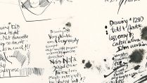
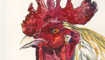
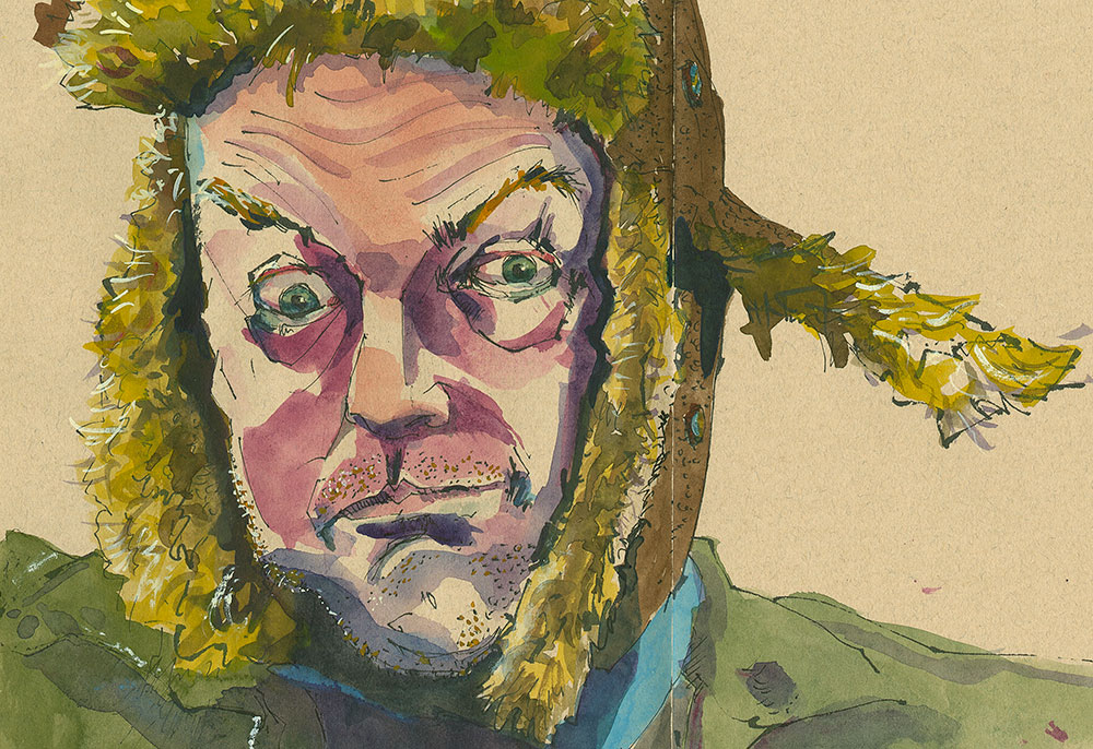
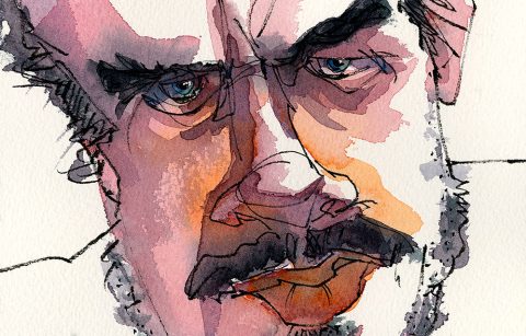
Here’s a sketch I did as a demonstration of how I use the Sailor Fudenosuke Fountain Pen (with Platinum Carbon Black ink.) (I used a photo from Sktchy as a reference for this sketch.)
I was working on Zerkall Nideggen, which is now a defunct paper. (I’m heart broken, I’ll write more about this later. Or maybe I’ll just internalize it.)
In the second image of today’s post you can see the sketch after I added watercolor.
If you would like to see me actually working on this image you can join my Patreon site where I posted the real-time video for Tier Three subscribers as an extra creativity post.
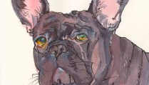
The main demo for the month, open to all subscribers, is a dog portrait, also on Niddegen. It was in the same journal I’d made and just picked up to start working in.
Whether you come and join me on Patreon or not, I hope that you will think about working on toned paper. It’s true that we are losing useful and delightful papers all the time, but you can still get fun results working on Strathmore 400 Series Toned Mixed Media paper (it’s heavier in weight than their toned drawing paper—pay attention to this if you’re buying journals with toned paper).
Stonehenge Printing and Drawing Paper comes in a number of lovely midtone-ish colors that you could use. (Since it’s a printmaking paper you’ll have to adjust your water usage a little, but it’s totally doable.)
If you don’t need to have an “art” paper you can always seek out commercial printing papers like French’s Speckletone. See a loose sheet journal I used it for here.
Next month, June, I’ll be talking about “proportions,” preparatory to moving into “looseness.” I also talk about goals and setting expectations as we move towards the “looseness.” And the internal critic is of course something that people need to deal with in that journey. Just as it might tell you your drawing sucks because it isn’t realistic enough, the internal critic can really sink its teeth into you when you’re trying something loose. Fun times ahead! I hope you’ll check it out. Subscribers get access to past demos and posts at their subscription level for the duration of their subscription.
